This article was originally published by a www.houzz.com . Read the Original article here. .

![]()
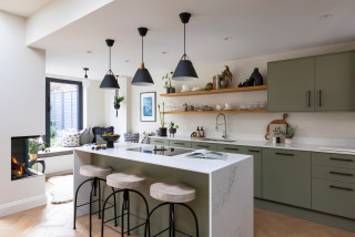
Designer: Carlos Nyce of TriVistaUSA Design + Build
Location: Arlington, Virginia
Size: 168 square feet (16 square meters); 11 feet, 8 inches by 14 feet, 5 inches
Homeowners’ request. “The client came to us seeking to improve their home layout, with one of the main goals being to enhance the flow for better entertainment space,” designer Carlos Nyce says. “They desired an open, functional kitchen layout, but the existing space didn’t allow for that. As part of our architectural design proposal, we suggested relocating the kitchen to the opposite side of the house, where more space was available. This change allowed us to reconfigure the kitchen, adding a highly functional island and additional storage. The client’s aesthetic preferences leaned toward clean lines, bright, warm wood tones, with touches of industrial style and a bit of glam.”
Wood cabinets. Natural maple wood cabinets in a matte finish. “They wanted their kitchen to feel bright, warm and cozy, while also introducing some industrial elements for contrast,” Nyce says. “We worked with the concept of using a lighter tone around the perimeter, paired with darker accents on the island, hardware and other details. The house facade featured black-painted brick, and [the homeowners] were keen on incorporating this dark color into the interior details. By integrating natural maple matte wood cabinets along the perimeter with a white brick-look tile backsplash, we achieved the perfect balance of cozy and industrial. The island, painted in Sherwin-Williams Tricorn Black, stands out against the lighter backdrop and provides just the right amount of darkness they were looking for.”
Other special features. Marble-look quartz countertops.
Designer tip. “Balance is key,” Nyce says. “To achieve the perfect look, you first need a clear reference for where you want your design to go. If you’re blending multiple styles, the key is always balance — incorporating textures, colors, materials and elements in the right proportions so the space feels harmonious.”
Find kitchen remodelers near you
This article was originally published by a www.houzz.com . Read the Original article here. .

Parents of three now-grown sons, the couple were finally ready to make serious changes. They hired designer Jodi Swartz to help improve both function and style. While the overall layout stayed mostly the same, two-tone custom cabinets in a classic white for the perimeter and a robin’s-egg blue for the expansive island give the kitchen a fresh look. A dual-fuel range in a soft shade of blue and blue backsplash tiles complement the island. Touches of black add dramatic contrast. Elegant marble countertops, warm oak flooring and a cozy seating area near a fireplace elevate the kitchen with timeless appeal.
This article was originally published by a www.houzz.com . Read the Original article here. .
A blue glass pendant light that previously hung in the breakfast area inspired the new look and balances all the clean lines with its vintage silhouette. Artwork and backsplash tiles in shades of blue and green complement the pendant and play nicely with cherry cabinets. The cabinets are a flat-panel style with horizontal pulls, conveying a midcentury vibe.
This photo was taken from where the fridge is in the next photo.
Backsplash tile: Natural Hues collection in Rain, Ireland and Starlight, Daltile; cabinets: Seaside in natural cherry, Tedd Wood
This article was originally published by a www.houzz.com . Read the Original article here. .

Murray pushed the kitchen into the adjacent den, which she relocated to another area. The former kitchen became a breakfast area that sits open to the new kitchen. The expanded footprint allowed for a breezy feel with a large walnut island that seats three people. Channeling English country style, Murray created custom cabinets painted a soft blue-gray, inspired by the color of common pigeons seen around London. Unlacquered brass hardware, exposed original wood ceiling beams and soapstone for the countertops, custom sink and backsplash add to the across-the-pond look.
This article was originally published by a www.houzz.com . Read the Original article here. .

The homeowners, who are parents of a toddler daughter, were looking for a soothing retreat with more warmth and an organic, spa-like feel. Getter removed the existing components, eliminated the tub (they have one elsewhere in the home) and relocated and enlarged the shower area. She also straightened out some angled walls. With the main design moves done, she introduced a warmer color palette with glazed aloe green ceramic tiles, a custom white oak vanity and brass details. Terrazzo-look porcelain tiles for the flooring and part of the low-curb shower add visual energy and interest.
This article was originally published by a www.houzz.com . Read the Original article here. .
![]()
“They were getting close to having an empty nest, and this house is within walking distance of Marietta Square,” McAdams says. The square is a popular draw in Marietta, as it’s full of cute shops and restaurants. The couple knew they wanted neutrals, particularly contrasting black and white. The designer worked closely with them to add comforting organic and soft touches that keep the black-and-white contrast from feeling too stark.
This article was originally published by a www.houzz.com . Read the Original article here. .

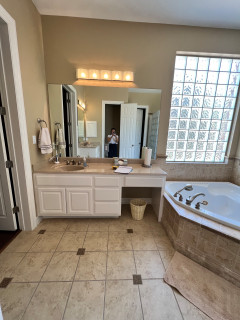
Cabinet hardware: Egg knob and Ascendra pull, both in polished nickel, Top Knobs; countertop: Magnifica Encore polished porcelain slab in Calacatta Super White, Bedrosians Tile and Stone
Read more about this bathroom makeover
This article was originally published by a www.houzz.com . Read the Original article here. .

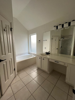
![]()
Designers: Lindsay Brungardt and Leslie Hatfield of Schloegel Design Remodel
Location: Kansas City, Missouri
Size: 73½ square feet (6.8 square meters)
Homeowners’ request. “Our clients had just one full bathroom in their home, and their dream was to transform their bedroom into a true primary suite by adding a full bathroom,” designer Lindsay Brungardt says. “They envisioned a space that was not only functional but also elegant, featuring a roomy layout, a vanity with ample storage and a design that honored the charm and character of their 1920s home.”
Vanity features. “The vanity, crafted in a furniture-style design, features rich walnut with a natural stain,” Brungardt says. “Its inset cabinetry beautifully reflects the era of the 1920s home, adding a timeless charm. To create cohesion, the species and style were chosen to match the kitchen island, which we remodeled simultaneously. Though compact, the vanity provides excellent storage with two functional drawer stacks and a central cabinet, maximizing organization. The furniture-style construction elevates the design, creating an open and airy feel that enhances the sense of space in the bathroom.”
Other special features. “The shower is a true centerpiece, showcasing antique blue tile walls paired with classic hexagonal floor tiles and a built-in bench for comfort,” Brungardt says. “Gold plumbing fixtures add a striking contrast, creating a touch of luxury that complements the blue tiles beautifully. A thoughtful design detail is the placement of the shower handle near the glass door, allowing the client to turn the water on and let it warm up without stepping inside — a small touch that adds big convenience.”
Designer tip. “The half wall paired with a glass panel next to the vanity creates a clever balance of openness and privacy,” Brungardt says. “This design not only makes the bathroom feel more spacious but also adds privacy in the shower. It’s an excellent solution for smaller bathrooms, maximizing light and flow while still providing subtle division.”
This article was originally published by a www.houzz.com . Read the Original article here. .
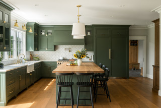
Kitchen at a Glance
Who lives here: A couple with four kids
Location: Shelburne, Vermont
Size: 353 square feet (33 square meters)
Designers: Jillian Bartolo of Peregrine Design Build (lead designer) and Lauren Miles (interior design)
Bartolo removed a structural wall to absorb the former dining room into the new kitchen, increasing the layout by 155 square feet. “We ended up relocating the dining room across the house,” says Bartolo, who worked with Miles on selecting finishes.
A 4½ -by-10-foot island with a flat-sawn white oak countertop creates a warm and welcoming spot for the family to gather. “It was my recommendation to go with a 2-inch-thick top that’s dramatic and creates a focal point,” Bartolo says. “For the scale of the island that big, the thickness is appropriate.”
Custom Shaker-style wood cabinetry is painted a warm green (Shade-Grown by Sherwin-Williams). A 36-inch paneled built-in refrigerator column and 30-inch paneled freezer (back right) and paneled dishwasher to the left of the sink help maintain the warm and inviting look. The wood-and-green palette join engineered wide-plank European white oak flooring, hand-painted marble backsplash tiles and marble perimeter countertops for an inviting English country look and feel.
A pocket door next to the refrigerator leads to the renovated mudroom, which has slate tile flooring. To the right of that doorway, on the white wall, is another pocket door (not shown) that opens to a spacious butler’s pantry.
Backsplash: Willow in Walnut, Artisan Stone Tile, StoneImpressions; paint colors: Ivory White (ceiling and trim) and Tapestry Beige (walls), Benjamin Moore; cabinetry: Pomerantz Woodworking; flooring: Tresor collection, Provenza Floors
Find kitchen remodelers near you
This article was originally published by a www.houzz.com . Read the Original article here. .

The cushions and artwork, in shades of blue, green and orange, bring dynamic color to the space, adding personality.
Sustainability is always a key consideration in Llogarajah’s projects. “Several existing elements were carefully integrated into the new design,” she says. Along with all the kitchen appliances and the sink, her design also incorporated the owner’s existing dining table and chairs to minimize waste.
“The design is tailored to seamlessly incorporate [all] these pieces, meaning the reused items feel intentional, as though they were always part of the overall scheme,” she says.