Photos by Anastasiya Andreychuk of Anastasiya Homes
Kitchen at a Glance
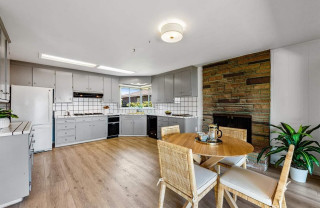
Who lives here: A couple with a baby and a toddler
Location: Bellevue, Washington
Size: 205 square feet (19 square meters)
Designer: Heidi Helgeson of H2D Architecture + Design
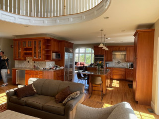
Nature and warm wood tones take center stage in the open kitchen. A generously sized island with seating and storage anchors the layout and keeps traffic flowing smoothly. “They were planning on doing quite a bit of entertaining and wanted a nice, big island,” Helgeson says.
Custom Shaker-style white oak cabinetry wraps the perimeter and the base of the island, finished in a natural stain and paired with knobs and pulls in a warm champagne tone. “We like to use white oak in homes because it’s a clean look and has a warm feeling without looking too orange,” Helgeson says. “It’s also a light wood with a rich grain to it. This area has lots of trees, and we wanted to try and do light and airy finishes in the space because of the shade from the trees.”
Polished quartz with a soft pearl undertone, hints of warm sand and an ivory marble pattern tops the island and perimeter counters. An engineered European oak floor in a light, wire-brushed finish adds another calming neutral. “We wanted to use actual wood for the floors,” Helgeson says. “But engineered wood gives them a sturdier finish because they have a dog. The light color was also a factor. The floor is a medium shade lighter than the cabinetry.”
Find a kitchen designer on Houzz


Kitchen at a Glance
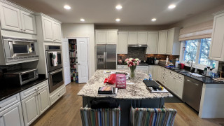
Who lives here: A couple with two kids — one in college and one still at home — and a labradoodle
Location: Richardson, Texas
Size: 430 square feet (40 square meters)
Designer: Tara Lenney Design
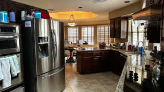
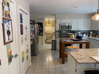
Before: The dreary, chopped-up, 310-square-foot kitchen had dark oak-stained cabinetry, granite countertops in brown, tan and black, and a beige ceramic tile floor. It also had what Lenney describes as “the world’s weirdest shape.” A black electric cooktop sat on an angled wall to the right, while a stainless steel double-bowl sink was positioned beneath two windows. (Take note of the window near the sink to help orient the view in the following “after” photo.)
A large stainless steel refrigerator protruded past surrounding cabinetry along a wall backed by a centrally located laundry room (see the before-and-after floor plans below) and was squeezed next to a pair of wall ovens. The laundry room further divided the kitchen from the closed-off dining room and sunken living room.
In the background, a short peninsula cut the kitchen off from the breakfast area and a den. “It was very uninviting,” Lenney says. “Everything was spread out in weird locations. It was also like a hallway. You’re trying to get your cooking done and there are literally people walking through your cooking area. If you were in the kitchen, you couldn’t be where anyone else was because of the layout.”
Find a kitchen designer on Houzz