Tag

Tour

Browsing


When retired lawyers Jim and Sheila Vidmar’s dream condo came on the market in Baltimore, the empty-nest couple knew they had to jump on it. The two-bedroom, two-bathroom corner unit on the 11th floor of a 24-floor former grain elevator built in 1923 offers sweeping views of the Patapsco River and Chesapeake Bay.

To help maximize the views and cozy up the industrial concrete-and-corrugated steel interiors, the Vidmars hired designer Brigid Wethington, who had worked with them on their previous home. Wethington, who used Houzz Pro software to manage the project, took inspiration from sunsets to bring in a palette of blues, whites and oranges. Durable fabric furnishings and multiple area rugs also soften the rooms, while walnut flooring in a herringbone pattern and other wood details add warmth. A layered lighting scheme enhances design elements without taking away from the stunning views.

Read more and save photos


This article was originally published by a www.houzz.com . Read the Original article here. .


Homes constructed by the postwar developer Joseph Eichler are coveted for many of the features that appealed to families in the 1950s and ’60s, including their modern style, indoor-outdoor flow and large expanses of glass. But other common aspects of the homes, including poor energy efficiency, closed-off kitchens and small square footage, aren’t very conducive to contemporary multigenerational living.

So after a family with a young daughter and twins on the way purchased one such home in Palo Alto, California, it set out to upgrade the home’s function and finishes and to add a grandparents suite. The homeowners hired Klopf Architecture, which is renowned for its sensitive Eichler remodels, to get the job done — and to ensure that the home’s architectural integrity and distinctive character were preserved in the process.


This article was originally published by a www.houzz.com . Read the Original article here. .


These homeowners, parents of three daughters, made a move toward their retirement years when they bought this forever home outside Atlanta. Design-wise, they were starting some scratch, so friends recommended Meriwether Design Group. After checking out the designers’ work on Houzz, the couple called the firm to help them make their new build their own. Designer Meriwether McAdams had a hand in every inch of the design, including the cabinetry, finishes, lighting, furniture and architectural details such as ceiling beams, paneling and a new fireplace surround.

“They were getting close to having an empty nest, and this house is within walking distance of Marietta Square,” McAdams says. The square is a popular draw in Marietta, as it’s full of cute shops and restaurants. The couple knew they wanted neutrals, particularly contrasting black and white. The designer worked closely with them to add comforting organic and soft touches that keep the black-and-white contrast from feeling too stark.


This article was originally published by a www.houzz.com . Read the Original article here. .


Sargent Design CompanySave Photo
Photos by Read McKendree

Who lives here: This is the vacation home of a couple with three adult children
Location: Near Woodstock, Vermont
Size: 5,290 square feet (491 square meters); five bedrooms, six bathrooms
Designers: Ann Shriver Sargent (interior design), David Sargent (architectural design), Sargent Design
Timber frame: Bensonwood
Builder: Housewright Construction

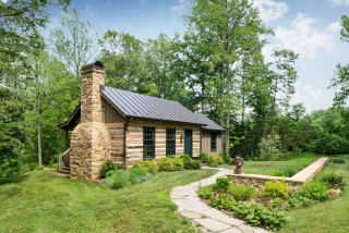
The original home on the more than 100-acre property is a cape-style farmhouse built in 1823. Its longtime owners — whose primary residence is in Massachusetts — hired David and Ann Shriver Sargent, the husband-and-wife team behind interior and architectural design firm Sargent Design, to build a guesthouse when the farmhouse started to feel too small for their growing family and friends.

The farmhouse is situated close to the road, at the bottom of a hill. To accommodate the property’s slope while staying true to the local architecture, the Sargents proposed modeling the guest quarters on a traditional timber-framed banked barn — a style of barn that’s built into a hillside, with “ground-level” entrances on two separate floors. The couple gave a thumbs up, then largely handed over the reins.

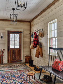
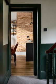
This mudroom entrance is next to the garage on the lowest level, which is essentially a walkout basement. Ann Sargent, who handled all of the interior design, placed antique rugs atop the heated slate floor and plenty of hooks on the wall to catch jackets as visitors come in from the cold. All of the home’s exterior doors, including this one, are made of reclaimed chestnut and have custom strap hinges and doorknob escutcheon (back) plates made by Vermont Country Iron.

Scroll to the bottom to see the floor plans for all three levels.

Find an interior designer on Houzz


This article was originally published by a
www.houzz.com . Read the Original article here. .


By the time the owners of this Victorian house in London called in interior designer Josie Lywood, they’d been living in the home for about eight years. “It was a perfectly livable space, but quite dated,” Lywood says. “They hadn’t done anything to it, as they knew they wanted to do a full refurb at some point.”

The house had already been extended at the back to create a kitchen, but this was quite narrow. A wall between two public rooms had been knocked down, creating a dark and underused living space in the center of the house. The owners wanted these structural issues resolved and an old cellar dug out to create a usable basement. They also needed more storage, particularly for coats and shoes — they have three children — and a downstairs bathroom.

“The brief was for a modern, cozy and homey scheme, harmonious with the original Victorian architecture,” Lywood says. “They were not afraid of color or pattern so we had a lot of fun creating this design.” Read on to see the beautiful results of this year-long project.


This article was originally published by a www.houzz.com . Read the Original article here. .


This 3,000-square-foot condo in Las Vegas was full of over-the-top casino-inspired ornamentation, right down to a black-and-red bathroom. While these art-collecting homeowners loved saturated color, it was quite the opposite of what they had in mind. They had worked with interior designer Daniella Villamil on their previous home and hired her to reimagine their new one as an inspiring, modern space. “This home was to be a retreat where they could relax, watch TV, work from home, hang out with their dog and look out at the great views of the Las Vegas Strip.”

Villamil knew her clients’ taste and their art collection well. The couple split their time between Las Vegas and Chicago, and the previous Las Vegas home she designed for them had been more than twice the size of this condo and was full of furniture customized to fit its large scale. She knew they’d be almost completely starting over with furniture but bringing favorite art pieces with them. “They love folk art, they love to support emerging artists and they are not the least bit afraid of color,” Villamil says.


This article was originally published by a www.houzz.com . Read the Original article here. .


Clites Architects, PCSave Photo
Photos by Stylish Productions

Cabin at a Glance
Who lives here: A couple
Location: Middleburg, Virginia
Size: 500 square feet (46 square meters)
Architect: Tim Clites of Clites Architects
Contractor: Richard Williams of Deerchase

The cabin sits in a clearing atop a hill, with views of the Bull Run Mountains. “[It’s] an easy walk from the main house, but it’s just far enough to feel like they are getting away,” Clites says.

The couple hired Clites, who had designed the main house, and contractor Richard Williams to make the cabin work for the activities they envisioned. New elements include openings for windows and doors, a chimney, a small addition (seen on the right with wood board-and-batten siding and a pigmented stain) and a back porch.

The late-18th- or early-19th-century cabin originally sat about 70 miles from where it is now. “[It] basically arrived as a bundle of logs,” Clites says. Williams had a bit of a giant Lincoln Logs puzzle on his hands. He and his team laid out the sills and joists on the ground first to see what they had and to get a measurement for the foundation.

Maintaining an authentic historical feel was the goal, but keeping the cabin frozen in time was not. Williams is passionate about old buildings. He paid meticulous attention to detail and sourced reclaimed materials. He also relied on a deep list of contacts, including expert craftspeople, to help give the log cabin authenticity.

One such craftsperson who worked on the project was Lewis Whitesell, an expert mason. He designed and constructed this chimney from fieldstones in a style that would have been used when the cabin was built. Even the firebox is fieldstone rather than firebrick. The half-barrel-shaped cap is a more modern detail that protects the chimney.

Find a local architect on Houzz


This article was originally published by a
www.houzz.com . Read the Original article here. .


When the homeowners of this split-level Victorian home first contacted interior designer Amy Hunt, they were struggling to know how to make their new place feel like home. They needed improved storage and comfortable furnishings and decor that would create a welcoming and relaxing atmosphere. “There were no wardrobes, no cupboards and just lots of hooks, so it really did need rethinking,” Hunt says. Aside from addressing the couple’s practical needs, Hunt, who uses Houzz Pro business software, introduced dark color and texture, both to warm up the home and to make the narrow spaces look bigger.

Read more and save photos


This article was originally published by a www.houzz.com . Read the Original article here. .


Dan Nelson, Designs Northwest ArchitectsSave Photo
Though the cabin was gone, it inspired the homeowners and Nelson to keep its modern style alive. The structure’s placement on the site also influenced the plan. There was an existing well and septic system, and upgrading the septic system was included in the project. The architects oriented the house to take advantage of the southwesterly views of the Saratoga Passage and Whidbey Island.

“The site is quite wooded and has a secluded feel,” Nelson says. “The approach to the house is through the trees and it feels totally private.” The site is atop a 60-foot cliff overlooking the water.

Facing the entry side of the house, the primary suite is on the left; a great room that contains the family room, dining room and kitchen is in the center; and two other bedrooms are on the right side. Next to those bedrooms, a mudroom-laundry room connects the house to the garage. The garage roof is covered in solar panels.


This article was originally published by a
www.houzz.com . Read the Original article here. .

Pin It