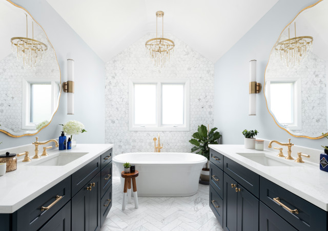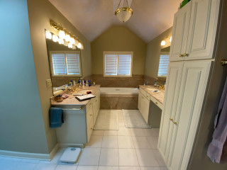
To freshen up the look and feel, the couple created an ideabook on Houzz, with inspiration photos they shared with Esslinger. He worked within the same basic footprint but ditched all the former materials and components. Lots of light and bright finishes brighten the space. Esslinger used the same marble tile in various areas, but to create visual interest and texture he played with pattern and shape — hexagons behind the tub, herringbone on the floor, large-format rectangles in the shower. Deep blue vanities and brass details elevate the style.
This article was originally published by a www.houzz.com . Read the Original article here. .
