Designer: Giana Shorthouse of Studio Giana
Location: Atlanta
Homeowners’ request. “The original kitchen was small, cramped and lacked storage and space to gather with friends and family,” designer Giana Shorthouse says. “It was remodeled to an expansive and multifunctional kitchen that includes a range of more function, spanning from the island and range wall to the custom-designed pantry, wall-to-wall china storage, a separate bar and a reworked butler’s pantry. We also built it out to include an adjacent covered outdoor space that carries the space from inside to outside.”
Shorthouse uses Houzz Pro business software to manage projects. “I use it for proposals, invoicing, purchase orders, and time and expenses,” she says.
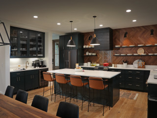
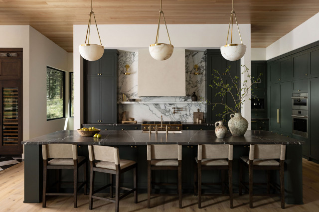
Dark and moody features. Dark warm-green island base (Andiron, Sherwin-Williams). Black-framed stools. Black pendant lights. “We went dark to give the space a richer and more dynamic feeling,” Shorthouse says. “The homeowners had lived in the home for over a decade with old, nonfunctioning windows and years of white paint, so when it came to colors we decided to go dark to give the space dimension and a richness it was missing before. Coming from prior years of loft living, the homeowners’ personal style reflects a more modern and industrial perspective, so when it came to finishes, we chose black to honor their personal style. Mixing dark green, black and aged brass details allowed us to blend their more modern outlook in a home that was fit for a more traditional style. I designed the island base with more classic detailing and color in mind but paired it with a more modern waterfall countertop to add contrast to the style.”
Other special features. Warm greige perimeter cabinets (Skipping Stone, Benjamin Moore). Pacific White marble countertops and backsplash.
Designer tip. “Balance through contrast,” Shorthouse says. “When you look at the material selections, you’ll notice that there is an inherent balance between materials because I chose to place darker materials next to lighter materials to create a lot of contrast.”
“Uh-oh” moment. “We had a construction mishap with the installation of the flooring,” Shorthouse says. “We chose to go with a limestone floor, and due to the settling in the home between the original foundation and the new foundation underneath the new addition, we started seeing cracks in the floor shortly after install, which had to be repaired and wasn’t ideal for such a beautiful flooring selection.”
Stools: Asher, Jamie Young; faucet: Lombardia, Rohl; wall, ceiling and trim paint: Alabaster, Sherwin-Williams
New to home remodeling? Learn the basics
This article was originally published by a www.houzz.com . Read the Original article here. .

