Tag

Living

Browsing


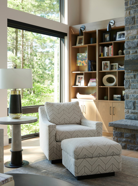
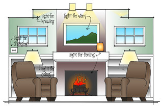
When I was growing up, my childhood living room was strictly off-limits to kids and reserved for my parents and their friends. In my current home, however, we do quite a bit of living in our living room. Therefore, having a lighting plan that covers all of my family’s activities in our living room is essential. My plan for a well-lit living room requires five layers of light.

David K Warfel at LightCanHelpYou.comSave Photo
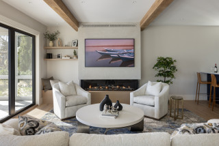
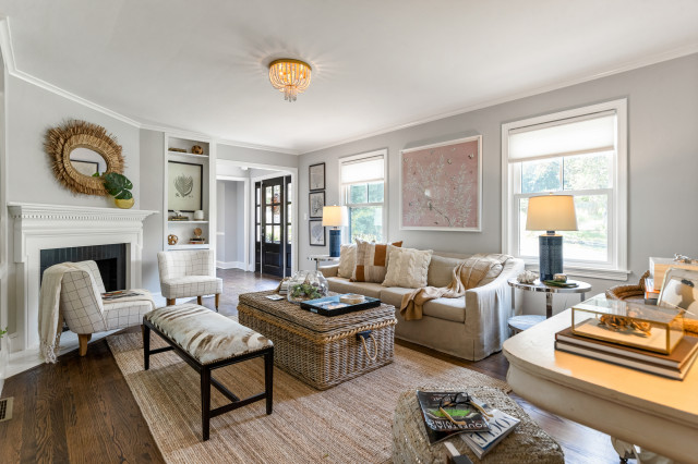
The five layers of light are as follows: Light for “doing” helps you read magazines and play games. Light for “knowing” helps you carry on conversations and move through the space. Light for “feeling” makes it easier to relax after a long day at work. Light for “changing” helps you adjust to the time of day and the task at hand. And light to help “tell your story” highlights your personal style and the items you cherish most.

Find an interior designer near you

MAR JENNINGS/S&J Multimedia LLCSave Photo
Layer 1: Light for Doing

We all use our living rooms differently, and that means you can benefit from carefully considering what common tasks you and your family perform in the living room before choosing lighting. Do you like to read? If so, good table lamps or floor lamps are a must. Prefer to watch television? Lamps might reflect on the screen, so dimmable downlights might offer a better solution. Playing games with friends? A brighter living room illuminated with both lamps and downlights can make interactions more enjoyable.

Shop for lighting products on Houzz

Duke RenovationsSave Photo
Layer 2: Light for Knowing

It’s important to know where you are and where you are going, and general ambient light can help. If you live with other people or have company in your living room, it is equally important to be able to see their faces. In a living room, good ambient light can come from wall sconces, which help define the scope of the room, from a few well-placed lamps at head-level to better see faces and from a ceiling cove overhead that diffuses light throughout the room.

Jodi Fleming DesignSave Photo
Layer 3: Light for Feeling

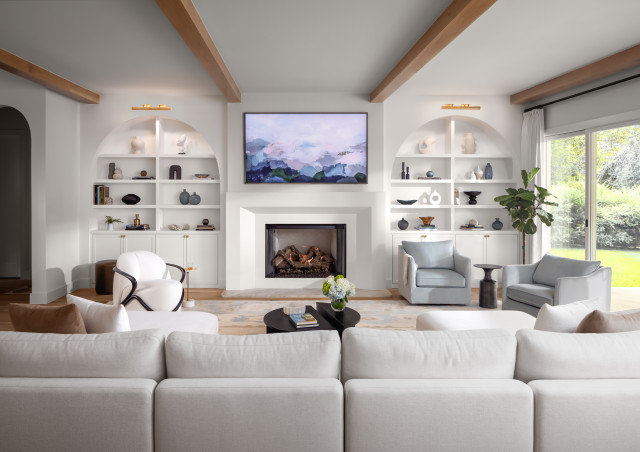
During a sunny day, a living room with abundant natural light flowing through windows can help us feel good. At night, however, we need to replace daylight with a layer of light that will make our space feel more comfortable and relaxing. Light for feeling can come from accent lamps, wall sconces, recessed downlights that highlight stone features, fireplaces and even from table lamps with soft, glowing shades.

Cushman Design GroupSave Photo
Prull Custom BuildersSave Photo
Layer 4: Light for Changing

We watch movies, read books, play games, work on our laptops, enjoy a fire and converse with friends in our living room. We keep the lights low for movies, higher for playing games and in between when relaxing with friends. Light for changing helps us adapt to tasks, the location of the sun and aging eyes. This might mean different lamps for different tasks and different times of day, or it can be achieved by adding dimmers that allow you to customize light from moment to moment.

Kate Nelson InteriorsSave Photo
Layer 5: Light for Telling Your Story

Finally, the lights in your living room can help tell your story, revealing your style and the items you cherish most. A spotlight on a painting by a friend lets everyone know you value both art and friendship, while a beautiful Tiffany lampshade might tell of your appreciation for artistry and color.

Choosing the style of decorative fixtures that fits you best is a great way to reveal your style, but decorative fixtures are not the only way to tell your story. Carefully hidden lights on a timber-framed ceiling disappear into the woodwork but highlight the craftsmanship of the structure without adding visual clutter to a room. Concealed lights in bookcases showcase collected items while adding a beautiful glow to the space.

More on Houzz
Read more stories about lighting
Get living room design ideas
Find a designer to help you plan your lighting
Shop for new lighting


This article was originally published by a
www.houzz.com . Read the Original article here. .


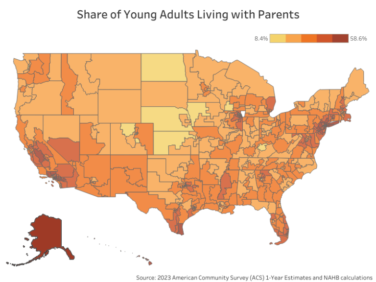
Building on the post-pandemic trend, the share of young adults (aged 25-34) living with their parents fell to a decade low, according to NAHB analysis of 2022 American Community Survey (ACS) Public Use Microdata Sample (PUMS). However, young adults continue to face difficult decisions about their living arrangements due to elevated home prices and increasing costs of living. While some young people established independent households during the pandemic, according to 2023 ACS data, many young adults continue to live with their parents in higher-cost areas, with variations across states and congressional districts.

In general, the share of young adults (aged 18-34) living with parents positively correlates with housing costs, particularly in coastal areas. This trend reflects young adults’ increasing financial burdens as both rents and home prices surge. A previous post demonstrated that more than half of renter households spend 30% or more of their income on housing, suggesting that affordability issues may delay young adults’ independence and path to homeownership.

In 2023, 31.8% of young adults (aged 18-34) lived with their parents at the national level using 2023 ACS data. Across congressional districts, the share of young adults living with parents varies significantly, reflecting different local housing affordability challenges. The shares are generally higher than the previous study, as this analysis includes adults aged 18-24. The top five congressional districts with the highest shares of young adults living with parents are located in areas with high housing costs and limited rental options. These districts include:

New York, District 3, 58.6%

New York, District 4, 56.5%

New York, District 1, 56.5%

California, District 38, 54.0%

New Jersey, District 5, 53.4%

In contrast, the bottom five congressional districts with the lowest shares of young adults living with parents are in major cities known for high housing costs, low homeownership rates and robust rental markets. As rental options provide more independence, a higher share of renter households in California, New York and Washington appears to be associated with fewer young adults living with parents. The bottom five districts include:

New York, District 12, 8.4%

Texas, District 37, 9.6%

California, District 11, 11.6%

Washington, District 7, 11.7%

District of Columbia, At Large, 12.2%

Discover more from Eye On Housing

Subscribe to get the latest posts sent to your email.


This article was originally published by a eyeonhousing.org . Read the Original article here. .


Dan Nelson, Designs Northwest ArchitectsSave Photo
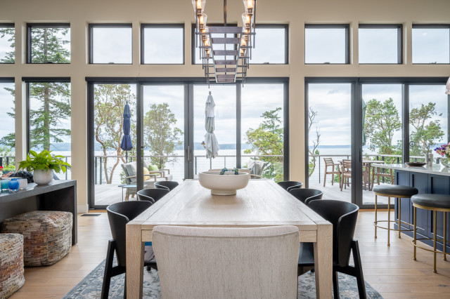
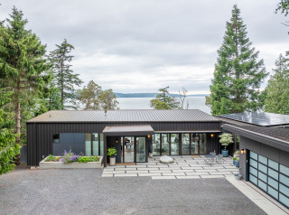
Though the cabin was gone, it inspired the homeowners and Nelson to keep its modern style alive. The structure’s placement on the site also influenced the plan. There was an existing well and septic system, and upgrading the septic system was included in the project. The architects oriented the house to take advantage of the southwesterly views of the Saratoga Passage and Whidbey Island.

“The site is quite wooded and has a secluded feel,” Nelson says. “The approach to the house is through the trees and it feels totally private.” The site is atop a 60-foot cliff overlooking the water.

Facing the entry side of the house, the primary suite is on the left; a great room that contains the family room, dining room and kitchen is in the center; and two other bedrooms are on the right side. Next to those bedrooms, a mudroom-laundry room connects the house to the garage. The garage roof is covered in solar panels.


This article was originally published by a
www.houzz.com . Read the Original article here. .


FOHR DESIGN STUDIO INC.Save Photo
4. Roll Out a New Area Rug

It’s a rare living room that doesn’t call for an area rug. Even in a carpeted room, an area rug helps to define a seating area and make a room feel complete. So if you don’t already have an area rug, or the one you have doesn’t reflect your current taste, this is a good opportunity for a refresh.

If you’re trying to make a formal living space feel more casual, consider a flat-woven or natural-fiber rug (such as jute). Tufted rugs with asymmetrical patterns or high-low textures are good bets if you’re looking to add a contemporary element to your room. Color-wise, light colors tend to make a room feel larger while darker colors make it feel more cozy. And the busier the patterns of your other textiles, the simpler your rug can be, and vice versa.

At least as important as the style of your rug is its size. A common recommendation is that all of the legs of your furniture — or at least the front legs of your seating — should be on the rug. If you love your current rug but it’s too small or irregularly shaped, you can layer it on top of a larger one. Natural-fiber rugs or solid, neutral-toned wool rugs are often good, affordable choices as base layers. A small, vibrant but well-worn antique Persian or Moroccan rug can look gorgeous over a large jute rug, for example.

All of that said, the “perfect rug” isn’t a specific size or style. It’s the one that most appeals to you and fits your lifestyle and budget.

11 Area Rug Rules and How to Break Them

Shop for an area rug


This article was originally published by a
www.houzz.com . Read the Original article here. .


Omnia ConstructionSave Photo
3. Comfortable Furniture

This is an obvious one but it’s worth emphasizing: Comfortable furniture is a must-have in a living room. That means using more soft fabrics, deep cushions and rounded edges rather than solid, hard-backed pieces and sharp corners. “I always tell my clients that the most important living room feature is comfort,” says designer Lindsey Machado of Designed With Grace & Joy. “We will always make any space look beautiful, so it’s more important to me that they’re also happy with the way it feels. That not only includes actual materials — think plush rugs, soft pillows and throw blankets, a nice-feeling sofa — but also ambiance.”

Designer Krista McGrath of McGrath Interiors tells homeowners to get the best-quality seating they can afford. “They will spend hours sitting on their furniture,” McGrath says, “so it should be very comfortable and hold up well.”

Designer ​Sabrina Lowe agrees. “The sofa is the one item in the living room that clients should put resources toward,” she says. “Most people who invest in a good couch have it for decades.”

Shop for sofas and sectionals


This article was originally published by a
www.houzz.com . Read the Original article here. .


With their first baby on the way, this Toronto couple wanted their yard to be family-friendly, with a grassy area for play. They also wanted an outdoor dining space and a pergola-covered lounge. Enter Alex Zalewski, a landscape designer and the co-owner of Infinite Possibilites Landscape Installation & Design. He worked with the homeowners on designing and installing these elements as part of a phased landscape design.

In addition, Zalewski added trees and shrubs for privacy and beauty, and redesigned the side yard. He kept easy maintenance at the front of his mind throughout the process. He also considered the master plan he’d drafted for the entire property. Later phases will include adding an outdoor kitchen and reworking the front yard.


This article was originally published by a www.houzz.com . Read the Original article here. .


Purple Bike DesignSave Photo
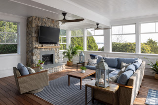
After: The renovated sunroom has the same footprint as before but feels like a different space. All-new windows offer an indoor-outdoor connection and a beautifully framed panorama. Gridded panes on the top half of the windows lend a traditional cottage feel, with single panes on the bottom offering unobstructed backyard views. The ceiling line matches that of the new porch, easily accessed through the propped open door seen here.

Amato envisioned a space that would embody indoor-outdoor living in a classic New England summer home. She wanted to “make you feel elevated but relaxed enough to spend the day your pajamas,” she says.

She used a mix of vintage finds, strategic investment purchases and some pieces the homeowners already had to create a comfy space for napping, reading and enjoying outdoor views. Patience is key, Amato says, when pulling together a layered, lived-in look like this.

Windows: Pella


This article was originally published by a
www.houzz.com . Read the Original article here. .


2. A Bit of Boho

Designer: Meliza Veloz Designs
Location: St. Petersburg, Florida
Size: 311 square feet (29 square meters); 16 feet, 7 inches by 18 feet, 9 inches

Homeowner’s request. “The homeowner wanted to blend bohemian, midcentury and modern styles in his space,” designer Meliza Veloz says. “Since he didn’t need much storage, the focus was on enhancing the room’s aesthetic appeal. The space was originally monotoned and empty, so we introduced color and carefully staged it to add vibrancy and personality. This transformation brought the room to life, achieving the eclectic and modern look the client desired.”

Special features. “We definitely used lots of organic materials in the typical nature of bohemian design, especially wood, between the honey accent table, the white oak base of the lamp or the dark mantel and ceiling fan,” Veloz says. “This client in particular loved cane and wicker, as seen in the featured baskets behind the couch, which are tied in throughout the whole home. We also utilized paint to frame out the TV (Iron Ore by Sherwin Williams) to create a frame effect and make it feel less visually obstructing.”

Veloz used Houzz Pro to manage this project. “I used Houzz for the entire process,” she says. “ I used the Mood Boards, Selection boards and proposals — that came in very helpful in the project.”

Designer tip. “Don’t be afraid to take up space,” Veloz says. “The gallery wall pictured on the right measures at approximately 12 feet in width and 8¾ feet in height, which is over 60% of the wall’s full surface area. Oftentimes homeowners will stray away from incorporating color at such a large scale, but when executed well those risks are what take a space from ‘furnished’ to ‘designed.’”

“Uh-oh” moment. “Our client was away on vacation for only five days, so we had less than a week to move everything into this home,” Veloz says. “With a limited timeline, every second counted. On day three, when the art finally came in, we realized that somewhere along the way the dimensions were mixed up and most of the pieces didn’t fit in the frames we ordered. Luckily we were able to reach out to the supplier and get PDF versions of the prints we needed, found the nearest FedEx and explained our situation. They were able to expedite our order and had them all to us the next day.”

Shop for living room furniture on Houzz


This article was originally published by a www.houzz.com . Read the Original article here. .


Edgewater Design GroupSave Photo
6. Hamptons-Inspired in Michigan

When designing this Norwood Township, Michigan, home for a retired couple with a large extended family, architectural designer Stephanie Baldwin of Edgewater Design Group took to heart the homeowner’s inspiration images of traditional Shingle-style homes and created something worthy of a Nancy Meyers movie. The welcoming front porch has an arched roofline echoed by the arched front door, the columns have real stone veneer at their bases and the bay on the right has a copper standing-seam roof.

To ensure that the lakeside home could survive the harsh climate and blowing sands from the Lake Michigan shoreline, Baldwin specified low-maintenance exterior materials, including vinyl shake shingles for the siding. Zip sheathing on the north- and west-facing sides of the house adds extra insulation and waterproofing.


This article was originally published by a
www.houzz.com . Read the Original article here. .

Pin It