Tag

Light

Browsing


When I was growing up, my childhood living room was strictly off-limits to kids and reserved for my parents and their friends. In my current home, however, we do quite a bit of living in our living room. Therefore, having a lighting plan that covers all of my family’s activities in our living room is essential. My plan for a well-lit living room requires five layers of light.

David K Warfel at LightCanHelpYou.comSave Photo
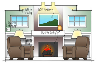
The five layers of light are as follows: Light for “doing” helps you read magazines and play games. Light for “knowing” helps you carry on conversations and move through the space. Light for “feeling” makes it easier to relax after a long day at work. Light for “changing” helps you adjust to the time of day and the task at hand. And light to help “tell your story” highlights your personal style and the items you cherish most.

Find an interior designer near you

MAR JENNINGS/S&J Multimedia LLCSave Photo
Layer 1: Light for Doing

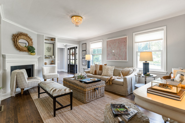
We all use our living rooms differently, and that means you can benefit from carefully considering what common tasks you and your family perform in the living room before choosing lighting. Do you like to read? If so, good table lamps or floor lamps are a must. Prefer to watch television? Lamps might reflect on the screen, so dimmable downlights might offer a better solution. Playing games with friends? A brighter living room illuminated with both lamps and downlights can make interactions more enjoyable.

Shop for lighting products on Houzz

Duke RenovationsSave Photo
Layer 2: Light for Knowing

It’s important to know where you are and where you are going, and general ambient light can help. If you live with other people or have company in your living room, it is equally important to be able to see their faces. In a living room, good ambient light can come from wall sconces, which help define the scope of the room, from a few well-placed lamps at head-level to better see faces and from a ceiling cove overhead that diffuses light throughout the room.

Jodi Fleming DesignSave Photo
Layer 3: Light for Feeling

During a sunny day, a living room with abundant natural light flowing through windows can help us feel good. At night, however, we need to replace daylight with a layer of light that will make our space feel more comfortable and relaxing. Light for feeling can come from accent lamps, wall sconces, recessed downlights that highlight stone features, fireplaces and even from table lamps with soft, glowing shades.

Cushman Design GroupSave Photo
Prull Custom BuildersSave Photo
Layer 4: Light for Changing

We watch movies, read books, play games, work on our laptops, enjoy a fire and converse with friends in our living room. We keep the lights low for movies, higher for playing games and in between when relaxing with friends. Light for changing helps us adapt to tasks, the location of the sun and aging eyes. This might mean different lamps for different tasks and different times of day, or it can be achieved by adding dimmers that allow you to customize light from moment to moment.

Kate Nelson InteriorsSave Photo
Layer 5: Light for Telling Your Story

Finally, the lights in your living room can help tell your story, revealing your style and the items you cherish most. A spotlight on a painting by a friend lets everyone know you value both art and friendship, while a beautiful Tiffany lampshade might tell of your appreciation for artistry and color.

Choosing the style of decorative fixtures that fits you best is a great way to reveal your style, but decorative fixtures are not the only way to tell your story. Carefully hidden lights on a timber-framed ceiling disappear into the woodwork but highlight the craftsmanship of the structure without adding visual clutter to a room. Concealed lights in bookcases showcase collected items while adding a beautiful glow to the space.

More on Houzz
Read more stories about lighting
Get living room design ideas
Find a designer to help you plan your lighting
Shop for new lighting


This article was originally published by a
www.houzz.com . Read the Original article here. .


Along Came LennoxSave Photo
4. Black-and-White Beauty

Designer: Kara Haren of Along Came Lennox
Location: Portland, Oregon
Size: 42 square feet (3.9 square meters); 5 feet by 8 feet, 4 inches

Homeowners’ request. “This bathroom is the main floor bathroom used by guests and occasionally by a muddy kid straight out of the backyard,” designer Kara Haren says. “The request was to make it fun — hence the playful patterned floor tile — and ultradurable, which is why we went with ceramic and porcelain tile and a quartz countertop.”

Shower details. “We decided to go with a low-curb shower here to avoid the accidental water-splashing issue that can occur with curbless showers,” Haren says. “We also wanted to create a slip-resistant shower pan, which is why we changed the floor tile within the shower to be a small mosaic tile. More grout lines, more texture.”

Other special features. “With a black-and-white tile palette, we wanted to warm up the space with a rift-cut white oak wood custom vanity,” Haren says. “We also dialed up the warmth with the Kohler Purist plumbing collection in brass. To add extra dimension to this bathroom, we went with two hanging light pendants flanking the mirror. We also added a floating walnut shelf with brass brackets above the toilet to hold both decorative and functional smaller items.”

Designer tip. “To make this space extra durable, we avoided white grout altogether,” Haren says. “We find white grout drives our clients crazy trying to keep it clean. The shower pan floor was done with the darkest charcoal grout, and both the patterned floor tile and classic white subway shower tile were done with a medium gray grout.”

“Uh-oh” moment. “The unexpected HVAC soffit location over the mirror had us thrown off,” Haren says. “But luckily we found an arch mirror we loved in the right height. And our lighting pendants were still height-adjustable — thank goodness for adjustable-cord pendants.”

Floor tile: Cementine Black and White, Arizona Tile

11 Big-Picture Bathroom Remodeling Trends


This article was originally published by a
www.houzz.com . Read the Original article here. .


Kelsey Leigh Design Co.Save Photo
5. Rift-Sawn White Oak

Designer: Kelsey McGregor of Kelsey Leigh Design
Location: Sarasota, Florida

Homeowners’ request. “This house is situated right on the water, so we wanted to make sure it felt in line with looking like a beach home without feeling overly theme-y,” designer Kelsey McGregor says.

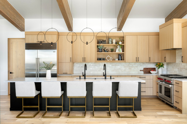
Wood cabinets. “We decided to go all rift-sawn white oak cabinetry here,” McGregor says. “Knowing that there was going to be limited upper cabinetry, especially on the focal range wall, we knew it wouldn’t feel too heavy. So we decided to go all wood with the cabinetry, knowing that the white walls would break it up and then it would create interest and warmth in the space.”

Other special features. “We didn’t want to use predictable blues and sea colors as the project’s color palette, but instead chose warm wood tones and the marble backsplash to introduce those ocean colors,” McGregor says. “I love the pairing of warm and cool tones in a space. The warm wood helps warm the cool of the marble and gray countertops and gray bar stools and gives the room a beautiful balance. The island countertop is made to look like cement, which pairs well with the textural bar stools, and the statement marble that was used on the perimeter countertop and backsplash has so much movement in its veining.”

Designer tip. “Get creative with storage,” McGregor says. “We want to make the kitchen cabinetry a little less predictable than just uppers and lowers. I like to eliminate upper cabinetry, and instead opted for counter-to-ceiling-height cabinets here on the range wall, giving it a breathier statement. Other creative storage ideas are adding open storage to the island or adding a marble shelf like the one here flanking the hood.”

Wall paint: Greek Villa, Sherwin-Williams

More on Houzz
Read more kitchen design stories
Browse kitchen photos
Hire a kitchen remodeler
Shop for your kitchen


This article was originally published by a
www.houzz.com . Read the Original article here. .


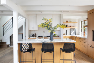
Kelsey Leigh Design Co.Save Photo
5. Rift-Sawn White Oak

Designer: Kelsey McGregor of Kelsey Leigh Design
Location: Sarasota, Florida

Homeowners’ request. “This house is situated right on the water, so we wanted to make sure it felt in line with looking like a beach home without feeling overly theme-y,” designer Kelsey McGregor says.

Wood cabinets. “We decided to go all rift-sawn white oak cabinetry here,” McGregor says. “Knowing that there was going to be limited upper cabinetry, especially on the focal range wall, we knew it wouldn’t feel too heavy. So we decided to go all wood with the cabinetry, knowing that the white walls would break it up and then it would create interest and warmth in the space.”

Other special features. “We didn’t want to use predictable blues and sea colors as the project’s color palette, but instead chose warm wood tones and the marble backsplash to introduce those ocean colors,” McGregor says. “I love the pairing of warm and cool tones in a space. The warm wood helps warm the cool of the marble and gray countertops and gray bar stools and gives the room a beautiful balance. The island countertop is made to look like cement, which pairs well with the textural bar stools, and the statement marble that was used on the perimeter countertop and backsplash has so much movement in its veining.”

Designer tip. “Get creative with storage,” McGregor says. “We want to make the kitchen cabinetry a little less predictable than just uppers and lowers. I like to eliminate upper cabinetry, and instead opted for counter-to-ceiling-height cabinets here on the range wall, giving it a breathier statement. Other creative storage ideas are adding open storage to the island or adding a marble shelf like the one here flanking the hood.”

Wall paint: Greek Villa, Sherwin-Williams

More on Houzz
Read more kitchen design stories
Browse kitchen photos
Hire a kitchen remodeler
Shop for your kitchen


This article was originally published by a
www.houzz.com . Read the Original article here. .


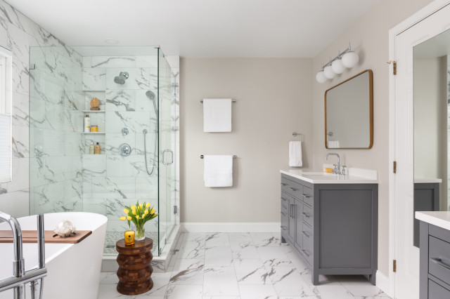
An overabundance of tan and brown finishes and a large built-in tub made for a drab and heavy look in Michael and Yoshie Davison’s primary bathroom. Yearning for a light and airy feel with a fresh style, they turned to designer Shelley Vilov and project manager David Jordan, both of whom had helped the couple update another bathroom in their home.

The remodeling team replaced the built-in tub with a freestanding model that helped loosen up the layout and allow for a bigger shower. White marble-look porcelain tiles cover the floor and the walls wrapping the shower and tub area, creating a brighter look. Pale gray walls also brighten the space, while midtone gray vanities and chrome fixtures and details add touches of fresh, modern style.


This article was originally published by a www.houzz.com . Read the Original article here. .
Pin It