
This article was originally published by a www.houzz.com . Read the Original article here. .

This Trending Now story features the most-saved kitchen photos uploaded to Houzz between Dec. 15, 2024, and March 15, 2025.
White-and-wood kitchen palettes have been extremely popular for years. But you’ll find fresh ideas for creating the classic combination in this countdown of the most-saved new kitchen photos uploaded to Houzz so far this year. You’ll also find neat storage ideas, creative island designs and more inspiring features and details worth saving to your own ideabooks.
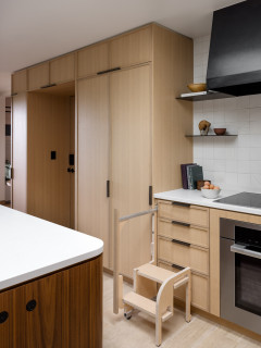
The slatted detail on the range hood is a subtle, on-trend addition to this Los Angeles kitchen by general contracting firm New Vision Builders. Warm wood cabinets, paneled appliances and a shared countertop and backsplash material contribute to the room’s pared-back — but not plain — look.
10 Easy Ways to Refresh Your Kitchen
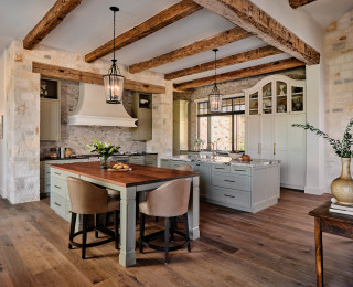
A barrel ceiling with rich walnut paneling and cove lighting is a showstopper in this Sherwood, Oregon, kitchen. Created by Holly Moore, Stacey Miller and Matt McQueen of Lifetime Remodeling Systems, the kitchen also has a large arched window and a smaller circular window that give the room a unique look and frame the spectacular wooded views. The walnut ceiling detail coordinates with the window trim, walnut cabinetry and detail on the decorative range hood.
Filled with compelling contrasts and special details, this Orange County, California, kitchen was designed by Alicia Torosian, who uses Houzz Pro business software to manage her projects. Torosian paired earthy green cabinets with white quartzite countertops around the kitchen’s perimeter, extending the quartzite partway up the range wall. Above the quartzite, a thin whitewashed-brick backsplash runs up to the vaulted shiplap-covered ceiling. At the center of the room, a dark wood island has a black granite countertop embellished with an ogee edge.
See why you should hire a professional who uses Houzz Pro software
Reeded glass-front accent cabinets extend from countertop to ceiling in this rich wood-toned Philadelphia kitchen by Bella B Home Designs. Lights inside the cabinets illuminate the dishware and enhance the reed detail, while modern torch-like sconces draw attention to the gold-and-black detail on the shapely range hood and the dramatic veining in the stone backsplash.
7 Exciting Design Trends for Kitchen and Bath Products in 2025
Patrick and Meghan Sharp of Mister + Mrs Sharp and builder John Bynum created this sophisticated Atlanta kitchen, which has white oak cabinetry with a medium brown stain, glazed white terra-cotta backsplash tiles and a marble-look quartz countertop. Behind the range top, the quartz swoops up with a graceful curve to meet a European-style range hood supported by corbels. Additional regal accents include the counter stools’ velvety upholstery and burnished brass accents such as the double gooseneck spout faucet and pot filler.
This Princeton, New Jersey, kitchen remodeled by The Home X has a limited palette of light wood, crisp white and shades of gray. But it’s full of luxe details. For example, an intricate backsplash composed of tiny tiles in a herringbone pattern stretches countertop to ceiling. Furniture-like legs support the island overhang. And delicate, cage-like chandeliers add opulent gold counterpoints to the cooler-toned and earthier elements.
New to home remodeling? Learn the basics
Remodeled by Broad Oaks Construction, this San Francisco kitchen features white upper cabinets paired with rift white oak lower cabinets with a clear stain. The two tones are bridged by a countertop and backsplash of Calacatta Paonazzo marble, which is prized for its bold golden, black and sometimes plum-colored veining. The back of the island has a reeded detail for extra visual interest and texture.
This article was originally published by a www.houzz.com . Read the Original article here. .

Designers: Kakin Nichols and Lauren Taylor of Curated Studio
Location: Highlands, North Carolina
Size: 238 square feet (22 square meters)
Homeowners’ request. “The goal was to design a functional space for entertaining family and friends that flowed effortlessly from room to room, blending seamlessly with the natural surroundings while letting the mountain views take center stage,” designer Kakin Nichols says. “Prioritizing function, we ensured ample circulation, providing plenty of space for multiple cooks to work comfortably. The color palette was carefully selected to complement, rather than compete with, the landscape. Drawing inspiration from the area’s changing seasons, we incorporated various shades of greens, rich browns and deep terra cotta to evoke a sense of warmth and tranquillity.”
Nichols uses Houzz Pro software. “We use it to pin items for furniture documentation and proposals, as well as time tracking,” she says.
Country-style elements. “The interior style of the home captures the timeless charm of traditional cottage architecture, blending warmth and character with a welcoming, livable atmosphere,” Nichols says. “We combined artisanal materials with simple, clean surfaces, pairing salvaged post oak wood flooring in varying widths and reclaimed columns with tongue-and-groove paneling and elegant quartzite countertops. The Pratt + Larson Craftsman collection ceramic backsplash tile adds color and texture, while the tongue-and-groove walls, painted in Soft Chamois by Benjamin Moore, and perimeter cabinets, painted in Natural Cream by Benjamin Moore, enhance the home’s inviting and cohesive feel.”
This article was originally published by a www.houzz.com . Read the Original article here. .

To play off the window’s stained glass, Wright Sentz designed leaded glass doors for some of the cabinets. They were fabricated by a craftsperson who lives in the neighborhood. She added LED rope lights inside the cabinets to illuminate them. To maintain the old-fashioned feel of the house, Wright Sentz stuck with a classic palette. The countertops are soapstone, the backsplash is white subway tile and the custom inset cabinets — painted a muted green (Comfort Gray by Sherwin-Williams) — are Shaker-style. The wood floors are original to the house.
All the brass on the plumbing fixtures and cabinet hardware is unlacquered, so it will develop a patina over time. While the white farmhouse sink and brass faucet have classic finishes, the details on the sink’s apron and the silhouette of the faucet are updated and fresh. Wright Sentz also included scalloped edges on the countertops, a bit of flair that nods to the detailed craftsmanship of Arts and Crafts homes.
Read more about this kitchen makeover
More on Houzz
Read more stories about kitchens
See photos of kitchens
Find a pro to work on your kitchen
Shop for kitchen products
This article was originally published by a www.houzz.com . Read the Original article here. .
Before Photo
4. Opened Up With Better Storage, Circulation and Style
Kitchen at a Glance
Who lives here: An empty-nest couple
Location: Carlsbad, California
Size: 300 square feet (28 square meters)
Designer: Lori Ramsay Design
Before: The former kitchen had an overwhelming amount of brown tones that ran together. The honey maple cabinets, brown granite countertops and backsplash and hand-scraped wood flooring looked and felt dated. A two-level peninsula with the main sink cut the kitchen off from the family room. A small island with a prep sink lacked adequate storage, and an awkwardly angled walk-in pantry to the right of the paneled fridge felt like wasted space.
On the left, an eat-in dining area took up 50 square feet and was just steps from the dining room, seen through the opening at back. There was also a soffit that wrapped the room, pushing the upper cabinets down and giving the room a heavy appearance. The homeowners hired designer Lori Ramsay to sort out the issues, maximize storage and add fresh style.
This article was originally published by a www.houzz.com . Read the Original article here. .
![]()
Designer: Carlos Nyce of TriVistaUSA Design + Build
Location: Arlington, Virginia
Size: 168 square feet (16 square meters); 11 feet, 8 inches by 14 feet, 5 inches
Homeowners’ request. “The client came to us seeking to improve their home layout, with one of the main goals being to enhance the flow for better entertainment space,” designer Carlos Nyce says. “They desired an open, functional kitchen layout, but the existing space didn’t allow for that. As part of our architectural design proposal, we suggested relocating the kitchen to the opposite side of the house, where more space was available. This change allowed us to reconfigure the kitchen, adding a highly functional island and additional storage. The client’s aesthetic preferences leaned toward clean lines, bright, warm wood tones, with touches of industrial style and a bit of glam.”
Wood cabinets. Natural maple wood cabinets in a matte finish. “They wanted their kitchen to feel bright, warm and cozy, while also introducing some industrial elements for contrast,” Nyce says. “We worked with the concept of using a lighter tone around the perimeter, paired with darker accents on the island, hardware and other details. The house facade featured black-painted brick, and [the homeowners] were keen on incorporating this dark color into the interior details. By integrating natural maple matte wood cabinets along the perimeter with a white brick-look tile backsplash, we achieved the perfect balance of cozy and industrial. The island, painted in Sherwin-Williams Tricorn Black, stands out against the lighter backdrop and provides just the right amount of darkness they were looking for.”
Other special features. Marble-look quartz countertops.
Designer tip. “Balance is key,” Nyce says. “To achieve the perfect look, you first need a clear reference for where you want your design to go. If you’re blending multiple styles, the key is always balance — incorporating textures, colors, materials and elements in the right proportions so the space feels harmonious.”
Find kitchen remodelers near you
This article was originally published by a www.houzz.com . Read the Original article here. .
A blue glass pendant light that previously hung in the breakfast area inspired the new look and balances all the clean lines with its vintage silhouette. Artwork and backsplash tiles in shades of blue and green complement the pendant and play nicely with cherry cabinets. The cabinets are a flat-panel style with horizontal pulls, conveying a midcentury vibe.
This photo was taken from where the fridge is in the next photo.
Backsplash tile: Natural Hues collection in Rain, Ireland and Starlight, Daltile; cabinets: Seaside in natural cherry, Tedd Wood
This article was originally published by a www.houzz.com . Read the Original article here. .

2. 1920s Spanish Colonial Charm
Kitchen at a Glance
Who lives here: A woman and her dog
Location: Kensington, California
Size: 252 square feet (23 square meters)
Designer: Anne Norton of AND Interior Design Studio
Before: This 1920s Spanish Colonial home in Kensington, California, has a long history, including being the residence of J. Robert Oppenheimer during his time at the University of California, Berkeley. But the home’s funky kitchen with post-and-beam architecture, flat, low, wood-covered ceiling with dark stain, dark floor, dark-stained Douglas fir cabinetry and numerous windows and skylights didn’t share that history; it was added on to the back of the home in the 1970s.
While the layout was good, the kitchen lacked storage. The homeowner, who loves to cook, found designer Anne Norton on Houzz to help her create a kitchen that would flow with the rest of the home’s historic architecture, and would include upgraded cabinetry and a kitchen table where friends and family, especially her grandchildren, could gather around.
This article was originally published by a www.houzz.com . Read the Original article here. .

Other design moves to open up and brighten the space included nixing some upper cabinets, using glossy white backsplash tiles that reflect light and having a lot more white wall space plus a white island counter. The remaining cabinets, the tall pantry cabinets to the left of the fridge and the niche shelving at the alcove ends provide all the storage needed.
Backsplash tile: Cloe in white, 5 by 5 inches, Bedrosians Tile and Stone
Read more about this project
This article was originally published by a www.houzz.com . Read the Original article here. .

Four cabinet hardware styles jazz up the look further: acrylic-and-brass pulls on the drawers, brass knobs on the perimeter doors, custom horn pulls on some of the island drawers and matte black knobs on the glass-front doors.
Other minimally invasive moves that made a major impact: extending the backsplash tile to the ceiling, adding a marble shelf (made from a remnant), placing sconces on the stove wall and swapping a dark runner for a light-colored patterned one.
Read more about this project
This article was originally published by a www.houzz.com . Read the Original article here. .

Kitchen at a Glance
Who lives here: A couple
Location: Leicestershire, England
Size: About 140 square feet (13 square meters); about 16 by 9 feet
Designer: Matt Fern of deVOL
Simple, honest materials, open cabinets and rich copper details combine to make this farmhouse kitchen feel warm and welcoming.
“It’s a classic Victorian staff kitchen in many ways — the open shelving, butler’s sink and scaffold-board [countertops] are all simple, functional features of an honest, hard-working space,” designer Matt Fern of deVOL says.
Materials were key in this project and copper and brass both feature heavily. “It was important that it wasn’t fussy or too polished,” he says. “It was important that it wasn’t fussy or too polished. They wanted a rustic farmhouse look with the emphasis on functionality,” Fern says.
Open cabinets were a careful design choice to create a warm, practical feel to the kitchen. “It’s an unashamed reflection of a working farmhouse kitchen, with all the pans on display where they’re close at hand,” Fern says.
“People are often reluctant to go for open cabinets, saying they’re just not tidy enough, but this couple embraced the idea, which was really refreshing,” Fern says. “They’re a good way to show your personality, whether you display decorative pieces or more functional items, such as colanders and crockery.”
9 Green Paint Colors to Consider for Your Kitchen