Tag

Kitchen

Browsing


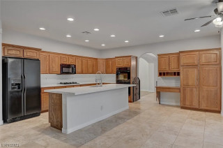
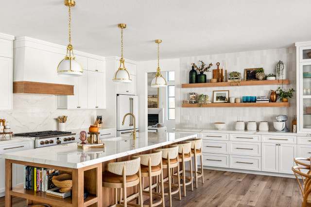
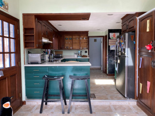
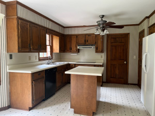
This retired couple bought a Colonial-style home in Sterling, Massachusetts, on 4 acres to be closer to their growing family and granddaughter. While they loved the classic architecture, they wanted to update the home’s neutral interiors. A big focus was revamping the kitchen and its basic honey oak cabinets, angled two-tier peninsula, standard white appliances and laminate countertops. The husband, a trained chef and former restaurant owner, wanted ample room for prepping and serving. The wife was looking for some color for the cabinets and wanted an elegant look and feel. For help they hired designer Ruth Bergstrom.

Bergstrom replaced the angled two-tier peninsula with a spacious L-shaped peninsula that adds work surface and seating. Updated appliances in a more user-friendly layout enhance function, while a polished marble-look quartz for the countertops and backsplash adds elegance and durability. Gray cabinets with subtle green and blue undertones bring a soft and soothing feel.


This article was originally published by a www.houzz.com . Read the Original article here. .


Parti Pris DesignSave Photo
5. They Know Where to Spend and Where to Save

“Sometimes the simple details are expensive; at other times, a design change can save so much money,” Berry says. “Always be open and honest with your designer about money. We have the knowledge and tricks to create the wow without a wow price tag.”

“I always advise my clients to spend the majority of the kitchen budget on the cabinetry and doors, as these get the most use,” Davis says. “The kitchen cabinets especially, although not necessarily seen, take the weight of the [countertop] and need to stay rigid for many years, so the doors stay aligned. I use the analogy of a car: You don’t see the chassis, but it needs to be high-quality to ensure a great vehicle.

“Where I often suggest clients can save money is on the appliances. We only sell quality brands, which means their entry-level products are still excellent quality, using the same components as the more expensive models. The difference is often in the features available, so I have a good chat with my clients to work out what features they can live without to help them choose the best-value appliances for their budget.”

McCrostie offers another tip: “Where a kitchen is totally custom, wider drawer stacks can be designed into the plan to reduce the overall number of cabinets, as drawers are more expensive than cupboards.”

7 Essential Features of a Well-Designed Kitchen


This article was originally published by a
www.houzz.com . Read the Original article here. .


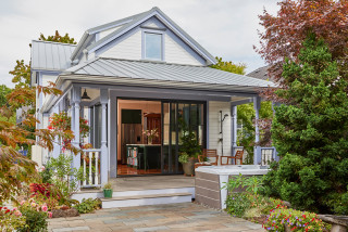
Nestled in the woods of an island on Lake Champlain, Vermont, this 1955 “seasonal camp” home is where empty nesters Lance and Dawn Trigg go to entertain family and friends. But the couple, who live primarily in Florida, didn’t feel the kitchen was party-ready. At issue were aging appliances, an abundance of pine paneling, green linoleum floors, blue-green laminate countertops and a peninsula that cut off traffic flow.

Wanting a brighter and more open space for cooking and entertaining, the homeowners looked at inspiration photos on Houzz. They then hired designer Britt Mee and builder Bill Wockenfuss to help them realize their vision. The remodeling team removed the peninsula setup and replaced an old staircase off the kitchen with a spiral version. Those moves added 141 square feet and created room for extended cabinetry and a new island with seating and storage. The island’s cool blue-green base, white perimeter cabinets and greige paneled walls establish a light and casual yet upbeat look. The refinished pine ceiling and new rustic pine flooring add tremendous warmth. Upgraded appliances and a bar station in the island ensure partygoers stay well stocked with plenty of food and drink.


This article was originally published by a www.houzz.com . Read the Original article here. .


This article was originally published by a
www.houzz.com . Read the Original article here. .


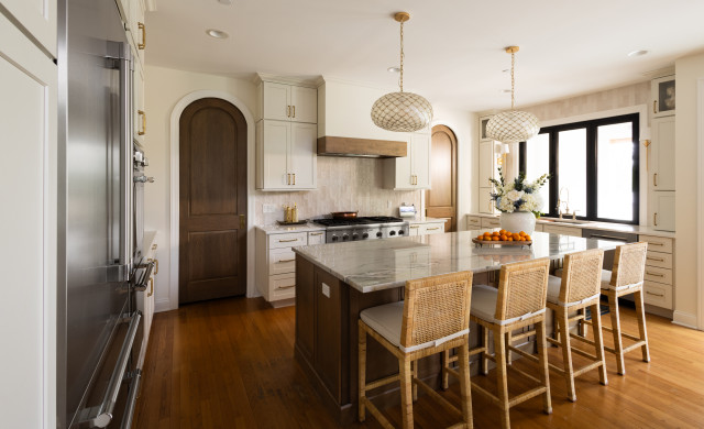
This Minneapolis couple and their three kids love cooking and baking together. But the cramped U-shaped kitchen in their 1904 home didn’t exactly feel family-friendly. To help them create a larger, more functional kitchen with improved storage, workspace and a personalized style, they hired designer Kate Roos to spearhead a major remodel.

Roos took over a mudroom to expand the kitchen, adding 45 square feet and freeing up room for an island with seating. A nifty rolling baking cart can tuck away into the island. The walnut island coordinates with a focal point range hood and red oak flooring to add warmth to the light gray perimeter cabinets and white tile. A colorful handmade backsplash design over the range punches up the space with playful personality.


This article was originally published by a www.houzz.com . Read the Original article here. .


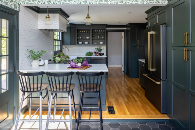
With busy jobs and two elementary school kids, Kendra Oxholm and her husband needed a kitchen that could keep up with their hectic lifestyle. Their existing kitchen didn’t come close. It sat closed off behind a wall separating it from the dining room. The space felt cramped. The cabinets lacked storage. And the materials — aging basic white cabinets, laminate countertops, tile flooring and blue wallpaper — felt dated and uninspiring. “I love to cook and knew this kitchen wouldn’t work for me,” Oxholm says.

Wanting more openness, efficiency, color and contemporary materials, the couple hired designer Sean Lewis for help. Lewis got to work knocking down the wall to open the kitchen to the dining room. He added a peninsula with seating that improves connection between the two spaces. Closing off an exterior door to the driveway freed up room to add more cabinetry and improve storage. Gray paint for the cabinets with brass hardware and other brass details creates an elegant style. A graphic black-and-white porcelain tile floor energizes the new kitchen, while a black-painted open pantry brings a dramatic touch.


This article was originally published by a www.houzz.com . Read the Original article here. .


The owners of this Minnesota home — professional musicians and California transplants — were drawn to its midcentury modern architecture. According to local lore, the house was designed by a protege of Frank Lloyd Wright’s in 1954. It’s a fabulous home filled with iconic midcentury details.

The kitchen, however, was not so fabulous. It was closed off from the rest of the house, making it feel dark. The appliances were old, and at some point someone had added red carpeting and a harvest gold range and countertops. While keeping the kitchen’s footprint intact, interior designer Colleen Slack was able to open up the room, provide adequate storage and countertop space, and create a look that jibes with the home’s classic midcentury style.


This article was originally published by a www.houzz.com . Read the Original article here. .


A generous dining space runs parallel to the kitchen. Against the wall is a bench seat containing drawers. The tall cabinet at the far end is one of a pair that bookend the bench. This one houses a boiler, while the other (out of shot) contains a tea and coffee station.

The cushions and artwork, in shades of blue, green and orange, bring dynamic color to the space, adding personality.

Sustainability is always a key consideration in Llogarajah’s projects. “Several existing elements were carefully integrated into the new design,” she says. Along with all the kitchen appliances and the sink, her design also incorporated the owner’s existing dining table and chairs to minimize waste.

“The design is tailored to seamlessly incorporate [all] these pieces, meaning the reused items feel intentional, as though they were always part of the overall scheme,” she says.


This article was originally published by a www.houzz.com . Read the Original article here. .


This home in Northampton, England, had a kitchen with an adjoining dining area and a living room in a conservatory, but it felt gloomy and cramped. The owner, who lives here with her two sons, found interior designer Eleni Fantis on Houzz and asked her to rethink the design. “[The owner] wanted a real family space, with defined areas, but where they could all gather, cook, entertain and enjoy being together,” Fantis says.

Before Photo

Sarah AlcroftSave Photo

Photos by Beth Saunders Photography

Kitchen at a Glance
Who lives here: A woman with two sons
Location: Northampton, England
Size: About 120 square feet (11 square meters); 12 by 10 feet
Designers: Eleni Fantis of Omorfia Interior Design (interior design) and Ezra Kerr of Jikoni Interiors (kitchen design)

Before: The original kitchen was put in when the house was built. While there was plenty of storage, the arrangement made the area feel cramped.

Fantis wanted to use a kitchen company that would make the most of the space. Enter kitchen designer Ezra Kerr.

Jikoni InteriorsSave Photo
Fantis’ solution to the dark area was to create a flow of light and space, while Kerr cleverly turned the kitchen into a cozy but high-functioning room.

The kitchen is the heart of the space and it was important that this was somewhere the owner could feel relaxed and enjoy making food, entertaining and teaching her boys to cook.

Find an interior designer on Houzz

Jikoni InteriorsSave Photo
The new design removed the bank of cabinets on the right, widening the room, but this meant Kerr needed to find a way to fit plenty of storage into the new layout.

Luckily, there’s a utility room through the door opposite the sink, so he didn’t need to find space for laundry appliances.

He made more use of the short wall with a full-height pantry cabinet — one of the owner’s key requests — a refrigerator and cabinets above and below the combination and standard ovens.

Kerr stopped short of the ceiling for a maximum sense of space. “Having units to the ceiling makes a room look smaller — when you can’t see the wall above, it closes everything in — so we left a gap,” he says.

Shop for your kitchen

Jikoni InteriorsSave Photo
In the corner, Kerr retained the base and wall cabinet arrangement to add some extra countertop space — a spot that serves as a good breakfast station.

The white doors are vinyl-wrapped, making them robust, and the white countertop is durable quartz. Kerr went with a curved ceramic sink to add interest.

Fantis chose pretty pink and blue tiles for the backsplash. “[The owner] didn’t really have any pattern in her home, so I wanted to incorporate some delicate patterns so as not to overwhelm her,” she says.

Kitchen cabinet paint: Satin White and Richmond Denim, Jikoni Interiors

Find a kitchen designer

Jikoni InteriorsSave Photo
As there was now no room on the ovens wall for a cooktop, Kerr came up with a neat solution — an angled peninsula.

“Usually, the [cooktop] would go on the back wall, but because there was no space, that was the only way we could do it. You could have had a [standard] peninsula, but we tried to make it a bit more special. It makes the kitchen feel cozy and works really well in the space.”

New to home remodeling? Learn the basics

Jikoni InteriorsSave Photo
There was originally a wall cabinet in this corner to the right, but Kerr swapped it for open oak shelves. “We didn’t want to block out any light, so it’s better if the look feels open,” he says.

The wood-look luxury vinyl tile flooring pairs well with the oak shelves, and looks and feels warmer than the original tiles.

Jikoni InteriorsSave Photo
The other side of the peninsula is curved, which not only gives it a softer feel, it also adds countertop space and makes it more sociable.

“[The owner] wanted us to fit in as many seats as we could,” Kerr says. “We created the circular shape so you can have people sitting round being sociable without all sitting in a line.” This section of countertop is oak, giving it the feel of a table.

The induction cooktop has a downdraft ventilation system that vents out through the wall. “An extractor hanging from the ceiling would have blocked the room,” Kerr says.

See why you should hire a professional who uses Houzz Pro software

Jikoni InteriorsSave Photo

Kerr has tucked a wine fridge and another cabinet into the peninsula unit. Neither is obvious from the living area, but they help maximize the storage.

Jikoni InteriorsSave Photo

An upholstered bench offers an additional seating spot when guests are over.

Before Photo

Omorfia Interior Design LtdSave Photo

Before: Originally, the dining area was in the small room to the left and the living area was in a conservatory to the right.

Jikoni InteriorsSave Photo

After: Fantis had most of the wall between the two spaces removed. She sited the seating area near the French windows and moved the dining area into the conservatory.

Light can now circulate between the spaces, making them feel brighter and bigger.

Jikoni InteriorsSave Photo

The large armchair between the living room and kitchen is key to the color scheme. “The floral fabric was actually the beginning of the whole design, and is a printed velvet,” Fantis says. “[The owner] loved it so much, I persuaded the supplier to sell me additional [fabric], which we then used for some of the blinds.”

The original dark red curtains have been swapped for these pale blue ones, which fit with the fresh, light color scheme and are less dominating.

Before Photo

Sarah AlcroftSave Photo

The conservatory roof had been badly lined in the past, so Fantis had that replaced.


This article was originally published by a
www.houzz.com . Read the Original article here. .

Pin It