
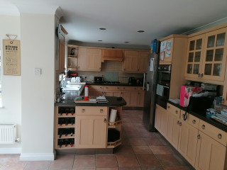
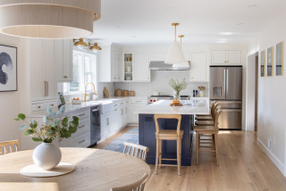
With busy jobs and two elementary school kids, Kendra Oxholm and her husband needed a kitchen that could keep up with their hectic lifestyle. Their existing kitchen didn’t come close. It sat closed off behind a wall separating it from the dining room. The space felt cramped. The cabinets lacked storage. And the materials — aging basic white cabinets, laminate countertops, tile flooring and blue wallpaper — felt dated and uninspiring. “I love to cook and knew this kitchen wouldn’t work for me,” Oxholm says.
Wanting more openness, efficiency, color and contemporary materials, the couple hired designer Sean Lewis for help. Lewis got to work knocking down the wall to open the kitchen to the dining room. He added a peninsula with seating that improves connection between the two spaces. Closing off an exterior door to the driveway freed up room to add more cabinetry and improve storage. Gray paint for the cabinets with brass hardware and other brass details creates an elegant style. A graphic black-and-white porcelain tile floor energizes the new kitchen, while a black-painted open pantry brings a dramatic touch.
This article was originally published by a www.houzz.com . Read the Original article here. .


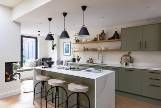


The cushions and artwork, in shades of blue, green and orange, bring dynamic color to the space, adding personality.
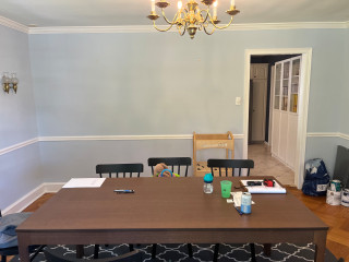
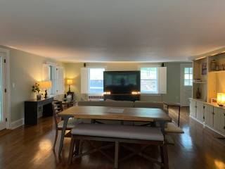
Sustainability is always a key consideration in Llogarajah’s projects. “Several existing elements were carefully integrated into the new design,” she says. Along with all the kitchen appliances and the sink, her design also incorporated the owner’s existing dining table and chairs to minimize waste.
“The design is tailored to seamlessly incorporate [all] these pieces, meaning the reused items feel intentional, as though they were always part of the overall scheme,” she says.