Tag

Inviting

Browsing


“I don’t want it to be beige, I want it to be fun!” That was the first direction the client gave interior designer Bonnie Bagley Catlin for the renovation of a family basement in Parker, Colorado. This meant bringing in color, texture, comfortable furniture and, perhaps most importantly, an inviting bar for entertaining. The homeowners, a couple with several kids who were away at college, had recently relocated from Texas. They knew they’d be renovating a good portion of their home. It was clear that the daylight basement would be the most popular spot for the whole family to gather when the kids were home from school, so it was renovated as part of phase one.

Photos by Michelle Gardner of M.G. Photography

Basement at a Glance
Who lives here: A couple of empty nesters
Location: Parker, Colorado
Size: 550 square feet (51 square meters)
Designer: Bonnie Bagley Catlin of Signature Designs Kitchen | Bath | Interiors
Contractor: Jim Ince of All About Bathrooms

Before: “I love working with clients who have relocated here,” Bagley Catlin says. Having moved to the Colorado Rockies from Southern California three years ago herself, she has a keen understanding of what it’s like for newbies who may feel like a fish out of water. This is helpful toward establishing trust early on in the design process.

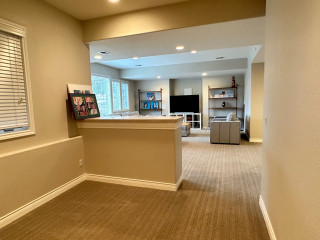
“This room was an empty box,” Bagley Catlin says. The project contractor had no idea what the half wall might contain and wanted nothing to do with trying to remove it. Instead, Bagley Catlin designed around it. One other existing detail to note is the white panel behind the TV. This is the main water shutoff for the house, and it was important to keep it accessible.

Find an interior designer on Houzz

Signature Designs Kitchen | Bath | InteriorsSave Photo
After: Fortunately, the half wall was in the perfect spot to serve as the bar the homeowners had on their wish list. The first selection they made was the beautiful live-edge piece of walnut that serves as its counter.

“Once I saw the counter installed, I knew we could not leave the bar’s base as drywall because it looked so unfinished,” Bagley Catlin says. “So I suggested we wrap it in fluted walnut paneling.” Local company Blacksheep Woodwork crafted both the walnut counter and paneling.

Shop for a sofa

Before: The bar area was a blank slate. It had a nice-size window for a basement that let in natural light.

Signature Designs Kitchen | Bath | InteriorsSave Photo
After: That window allowed Bagley Catlin to go dark in the bar area without turning it into a black hole. The cabinetry is rift-sawn white oak with a dark stain. The upper cabinets have ribbed glass doors. “This texture subtly distorts what’s behind the glass,” Bagley Catlin says.

Blacksheep Woodwork also crafted the bar’s live-edge walnut shelves and routed channels in the bottoms of them for LED rope lights. The lights wash down the backsplash wall and illuminate the countertop.

Find a local carpenter on Houzz

Signature Designs Kitchen | Bath | InteriorsSave Photo
“The green tile is everything,” the designer says. The backsplash tile is ceramic with a crackle finish. “Installing crackle tile can be more labor-intensive. Because it can be porous, it needs to be sealed before it’s installed,” Bagley Catlin says. “The finish almost looks like it has waves in it, and it looks aged. There is a longer lead time on this tile because it is custom-made to order.”

This countertop is a durable quartz from Pental. Its gray coloring takes a back seat to the star of the room, the green backsplash tile.

Backsplash tile: Eliot Brazil crackle tile, Encore Ceramics

Signature Designs Kitchen | Bath | InteriorsSave Photo

“We really maxed out the functionality of this bar,” Bagley Catlin says. There’s a beverage fridge, a wine fridge, a panel-front ice maker and a bar sink. For storage, there’s a mix of glass-front and solid cabinet storage, as well as open shelves for display.

Signature Designs Kitchen | Bath | InteriorsSave Photo
The flooring is composed of luxury vinyl planks. This is a good choice for a basement and has a hardwood look. The leather bar stools add a rugged Colorado touch.

Flooring: Prominence Plus Ash Oak, Shaw Floors

Browse bar and counter stools in the Houzz Shop

Signature Designs Kitchen | Bath | InteriorsSave Photo

Wanting to bring the fun of the backsplash over to the bar seating, the homeowners chose to add a green epoxy to the walnut countertop.

Signature Designs Kitchen | Bath | InteriorsSave Photo

“I suggested the vertically oriented grid composition for the backsplash to give it a different dimension from the usual,” Bagley Catlin says. “I also suggested we go with a medium grout rather than a dark one to really set the tile off in contrast.”

Signature Designs Kitchen | Bath | InteriorsSave Photo
In the family room, custom built-ins were important and worth the investment. The carpenter included easy access to the water shutoff. The TV swings out to reveal it. A mix of closed and open storage in the built-ins allows for display up top, with room for things like games and extra blankets below. “This couple loves to travel and they lived in Japan for a while, so they wanted places to display things they’ve collected from around the world,” Bagley Catlin says.

“The green color and the dark cabinets on the bar side across the room are so intense that I knew we needed a color punch on the built-in wall,” she says. Sherwin-Williams’ Still Water anchors this side of the room in a deep blue.

Wall color: Natural Tan, Sherwin-Williams; trim color: Simply White, Benjamin Moore

Signature Designs Kitchen | Bath | InteriorsSave Photo

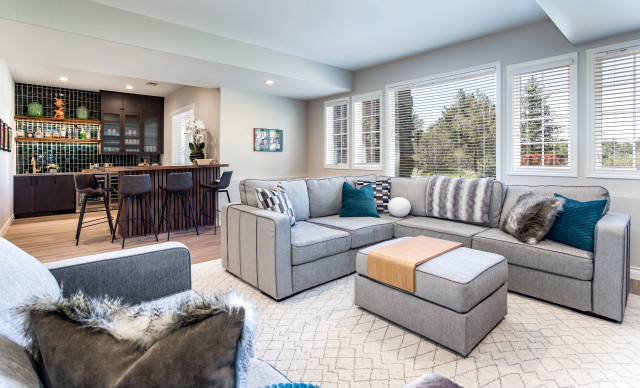
The couple chose and sourced the upholstered furniture and the rug themselves. “They wanted a place for the whole family to hang out and be comfy,” Bagley Catlin says. “I added custom pillows to elevate the look.” The throw pillows and blankets zhuzh the seating up, add punches of color with earth tones mixed in, and bring in a Colorado mountain (faux) furry feeling.

Signature Designs Kitchen | Bath | InteriorsSave Photo


This article was originally published by a
www.houzz.com . Read the Original article here. .


Native plants are known for their hardiness and ability to thrive with little maintenance, given the right conditions. After all, they’ve spent plenty of time evolving with and adapting to local conditions. They also offer food and shelter to birds, butterflies, bees and other beneficial wildlife. While it might be too late to plant this year in regions with cold winters, fall is the perfect time to get native plants in the ground in warmer regions. For everyone else, the garden projects below, including one for which the pro was found on Houzz, can inspire your planning for spring.

“After” photos by Carla Capdevila

1. Discovery Channels

Yard at a Glance
Location: Las Rozas, Madrid, Spain
Size: About three-quarters of an acre
Landscape designer: Santiago Herrero de Egaña of Paisajes Pensados

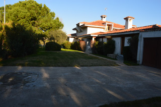
Before: Lawn had a monopoly at this villa in Spain, comprising more than two-thirds of the property’s outdoor environs. The homeowners wanted a yard that would require less water, look more natural and be pleasant to stroll through, and they also wanted to preserve its connection to an adjacent golf course. They found landscape designer Santiago Herrero de Egaña on Houzz and brought him in to reinterpret the site with biodiversity and the natural surroundings in mind.

PAISAJES PENSADOSSave Photo
After: Herrero de Egaña reduced the lawn by 90% and brought in native plants that boost interest and connect with the surroundings — and are less thirsty than all that grass had been. At the home’s entrance, seen here, he created a versatile sandy area that the homeowners can use for parking a car or throwing outdoor parties.

Find a local landscape designer on Houzz

PAISAJES PENSADOSSave Photo
This garden at the side of the house shows colorful and interesting native plants — and how a winding path can add intrigue and a sense of discovery. The photos here don’t convey how complex the property’s landscape is. At the back of the house, facing the golf course, is a steep slope. It now brims with vegetation and has stairs leading to another garden. An enticing natural pool also now lies at the back of the house, waiting to be discovered. It’s surrounded by plants that offer lovely year-round interest.

Read more about this project

“After” photos by Joshua Link

2. Limited Additions

Yard at a Glance
Who lives here: Tim Lindholm, a senior executive at L.A. Metro; Michelle Fierro, an accomplished local artist; their two daughters; and their goldendoodle
Location: Eagle Rock neighborhood of Los Angeles
Size: One-tenth of an acre, including the front and back yards
Landscape architect: Joshua Link of Ecotone Studios
Landscape contractor: Natural Earth Landscaping, which also oversees maintenance

Before: A renovation had given this Los Angeles ranch home contemporary style, but the asphalt driveway and barren front yard had no style to speak of. Landscape architect Joshua Link and the homeowners landed on the idea of using a limited color palette for the yards in front and out back, reflecting the newly redone home’s black-and-white scheme.

Ecotone StudiosSave Photo
After: Nearly every plant used is a native from a neighboring locale, a strategy Link says is important for supporting local wildlife species that depend on these plants for food and shelter. Out front by the sidewalk, a new charred wood shou-sugi-ban gate (by Accoya) backs billowing mounds of ‘Canyon Prince’ wild rye (Leymus condensatus ‘Canyon Prince’, USDA zones 8 to 10; find your zone).

On the gate’s other side is an expansive entry court (shown here) for parking or parties, bordered by more wild rye and other low-growing, finely textured plants — many of which release appealing fragrance when brushed up against.

The entryway is mostly pea gravel; its permeability helps drain and manage stormwater on the site.

10 Gardens That Capture and Drain Water With Style

Ecotone StudiosSave Photo
Formerly a plain brick patio, the backyard area is now an extension of the home and a hub for entertaining. The plantings here are lush and loose, with hardscape blending into them, creating a wild look to balance the yard’s stark, modern features.

Near a new custom spa, the plants include Catalina Island mountain mahogany (Cercocarpus traskiae, zones 8 to 10) and red shanks (Adenostoma sparsifolium, zones 8 to 10). A block wall painted black (Black by Benjamin Moore) sets off the silver, white and gray foliage beautifully.

Read more about this project

Before Photo

Hursthouse Landscape Architects and ContractorsSave Photo

“After” photos by Jimi Allen

3. Prairie League

Yard at a Glance
Who lives here: Bob and Robbi Hursthouse
Location: Millbrook, Illinois
Size: 1½ acres
Landscape architect and builder: Hursthouse Landscape Architects and Contractors

Before: Much of this 1½-acre Illinois countryside was covered in lawn. Not only was it uninteresting and water-hogging, but a drainage swale in the front yard made mowing difficult. Landscape architect Bob Hursthouse, who lives here with his wife, looked to the tallgrass prairies for design guidance.

Hursthouse Landscape Architects and ContractorsSave Photo
After: Transformed into a meadow, the new front yard brims with pollinator-attracting local natives. Large boulders placed as steppingstones help garden wanderers navigate the swale as they venture through the meadow to the lawn beyond.

This is just a small portion of the expansive front yard, which has five climatic zones — requiring extra-careful planning — and more than 40 species of native pollinator attractors.

How to Find the Right Native Plants for Your Yard

Hursthouse Landscape Architects and ContractorsSave Photo
“After” photo by Jeff McNeill

4. Art of Gardening

Yard at a Glance
Who lives here: A couple and their young children
Location: Toronto
Size: 3,660 square feet (340 square meters)
Designers: Mary Tremain, Eric Klaver, Niloufar Makaremi and Margot Shafran of Plant Architect
Contractor: Oriole Landscaping

Before: With three sculptures by the former artist owner and lush plantings around a curved path, this Canadian backyard had a magical, romantic air. But it was overgrown, didn’t fit the look of the home’s newly redesigned contemporary architecture and didn’t create a strong connection between the house and the greater landscape. Architecture firm Plant Architect came on board for the makeover.

PLANT Architect Inc.Save Photo
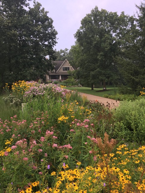
After: The team kept all three sculptures, one of which is seen here, and reused the flagstones and several shrubs and other plants. A wide range of grasses and perennials fills the new backyard design — mostly native species and plenty of pollinator attractors. Woodlands inspired the left-hand side, while the right-hand side nods to meadows.

Purple coneflower (Echinacea purpurea, zones 3 to 8) toward the middle of the yard and bright yellow rudbeckia in the foreground add delightful splashes of color. Note also how both the hardscaping and the plantings transition from crisp and tidy near the house to looser and wilder farther away.

Read more about this project

More on Houzz
Read more landscape design stories
Browse landscape photos
Find a landscape designer
Shop for outdoor products


This article was originally published by a
www.houzz.com . Read the Original article here. .


Kelsey Leigh Design Co.Save Photo
5. Rift-Sawn White Oak

Designer: Kelsey McGregor of Kelsey Leigh Design
Location: Sarasota, Florida

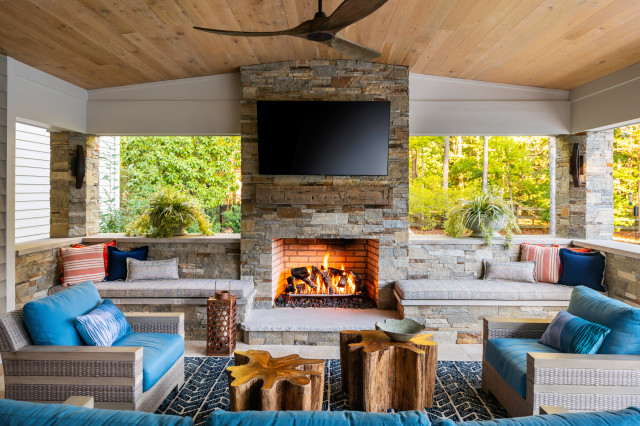
Homeowners’ request. “This house is situated right on the water, so we wanted to make sure it felt in line with looking like a beach home without feeling overly theme-y,” designer Kelsey McGregor says.

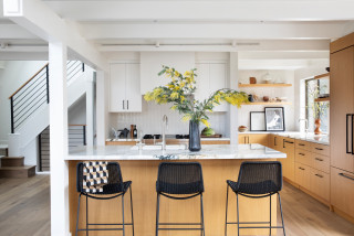
Wood cabinets. “We decided to go all rift-sawn white oak cabinetry here,” McGregor says. “Knowing that there was going to be limited upper cabinetry, especially on the focal range wall, we knew it wouldn’t feel too heavy. So we decided to go all wood with the cabinetry, knowing that the white walls would break it up and then it would create interest and warmth in the space.”

Other special features. “We didn’t want to use predictable blues and sea colors as the project’s color palette, but instead chose warm wood tones and the marble backsplash to introduce those ocean colors,” McGregor says. “I love the pairing of warm and cool tones in a space. The warm wood helps warm the cool of the marble and gray countertops and gray bar stools and gives the room a beautiful balance. The island countertop is made to look like cement, which pairs well with the textural bar stools, and the statement marble that was used on the perimeter countertop and backsplash has so much movement in its veining.”

Designer tip. “Get creative with storage,” McGregor says. “We want to make the kitchen cabinetry a little less predictable than just uppers and lowers. I like to eliminate upper cabinetry, and instead opted for counter-to-ceiling-height cabinets here on the range wall, giving it a breathier statement. Other creative storage ideas are adding open storage to the island or adding a marble shelf like the one here flanking the hood.”

Wall paint: Greek Villa, Sherwin-Williams

More on Houzz
Read more kitchen design stories
Browse kitchen photos
Hire a kitchen remodeler
Shop for your kitchen


This article was originally published by a
www.houzz.com . Read the Original article here. .


Kelsey Leigh Design Co.Save Photo
5. Rift-Sawn White Oak

Designer: Kelsey McGregor of Kelsey Leigh Design
Location: Sarasota, Florida

Homeowners’ request. “This house is situated right on the water, so we wanted to make sure it felt in line with looking like a beach home without feeling overly theme-y,” designer Kelsey McGregor says.

Wood cabinets. “We decided to go all rift-sawn white oak cabinetry here,” McGregor says. “Knowing that there was going to be limited upper cabinetry, especially on the focal range wall, we knew it wouldn’t feel too heavy. So we decided to go all wood with the cabinetry, knowing that the white walls would break it up and then it would create interest and warmth in the space.”

Other special features. “We didn’t want to use predictable blues and sea colors as the project’s color palette, but instead chose warm wood tones and the marble backsplash to introduce those ocean colors,” McGregor says. “I love the pairing of warm and cool tones in a space. The warm wood helps warm the cool of the marble and gray countertops and gray bar stools and gives the room a beautiful balance. The island countertop is made to look like cement, which pairs well with the textural bar stools, and the statement marble that was used on the perimeter countertop and backsplash has so much movement in its veining.”

Designer tip. “Get creative with storage,” McGregor says. “We want to make the kitchen cabinetry a little less predictable than just uppers and lowers. I like to eliminate upper cabinetry, and instead opted for counter-to-ceiling-height cabinets here on the range wall, giving it a breathier statement. Other creative storage ideas are adding open storage to the island or adding a marble shelf like the one here flanking the hood.”

Wall paint: Greek Villa, Sherwin-Williams

More on Houzz
Read more kitchen design stories
Browse kitchen photos
Hire a kitchen remodeler
Shop for your kitchen


This article was originally published by a
www.houzz.com . Read the Original article here. .
Pin It