
This article was originally published by a www.houzz.com . Read the Original article here. .


“The owners saw the house in early 2020,” designer Natalie McHugh of N&K Interiors says. “They were keen to get going on extending it for their family and found us on Houzz when they searched local design and build companies, but COVID delayed everything.”
In September 2020, the team tackled a bathroom and four bedrooms, one of which was turned into a playroom, as well as changing all the windows and got the family in for Christmas. In January, they started the two-story side addition — laundry room, mudroom, powder room, living room and bedroom suite. The remaining work was completed in 2022, resulting in a home that’s both highly functional and full of warmth and character.
This article was originally published by a www.houzz.com . Read the Original article here. .

House at a Glance
Who lives here: A woman
Location: Seattle
Size: 1,506 square feet (140 square meters); three bedrooms, 1½ bathrooms
Designer: Tammara Stroud
Contractor: Dave Headland of Headland Construction
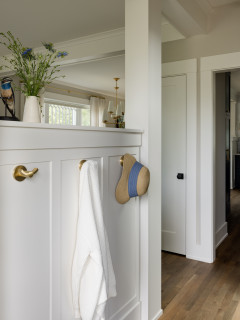
The entry reveals a view straight back to the kitchen, to the dining room toward the back left and to the living room on the other side of the half wall seen here. The door opens to a coat closet.
“The one thing my client really wanted in here was hooks for her friends to hang their purses up,” Stroud says. This keeps them off her kitchen counters.
“The house was sinking. The foundation needed to be jacked up and the floors needed to be leveled,” Stroud says. This meant replacing all the flooring. The new hardwoods create consistency throughout the first floor, add warmth and suit the home’s age.
Find an interior designer on Houzz
This article was originally published by a www.houzz.com . Read the Original article here. .
![]()
House at a Glance
Who lives here: A family of five with two dogs
Location: Houston
Size: Six bedrooms, eight bathrooms
Designers: Lynn Holender Designs (interior design) and Sullivan, Henry, Oggero and Associates (architecture)
Builder: Unika Homes
To understand the homeowners’ style and Holender’s approach, it’s best to start in the parlor. “They both love the work of artist Donald Robertson. This painting that they already owned needed a place of importance,” she says. The wife’s favorite color is blue and the husband’s is green. Holender gave each of them spaces that highlighted these hues.
“My client didn’t like the idea of a formal living room. She preferred the idea of a parlor,” Holender says. She liked that the word had its origins in the French word parler, which means “to speak.”
“This room encourages people to converse, make music and make connections without screens,” the designer says.
Find an interior designer on Houzz
This article was originally published by a www.houzz.com . Read the Original article here. .

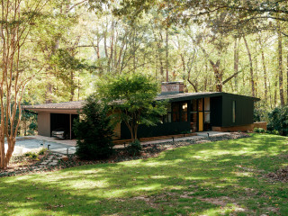
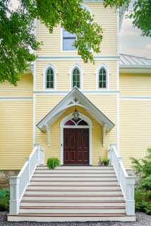
Arnold also had the overgrown vegetation along the front of the home removed and added a poured-in-place concrete paver pathway.
The exterior architecture of the home remained largely the same, including the windows, some of which have an unusual pivot-slide function.
“They’re really beautiful,” Arnold says. “You’re not really going to get any made like that again.”
Exterior paint: Iron Ore, Sherwin-Williams
This article was originally published by a www.houzz.com . Read the Original article here. .

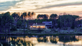
The home had room for expansion in a large space over the garage and in the unfinished lower level. In addition, Cushman bumped out the footprint in a few key places. Other design priorities included bringing more light into the house and creating better connections to the outdoors. The finished home has a polished rustic look and is the perfect place for making lifelong memories.
This article was originally published by a www.houzz.com . Read the Original article here. .

To get reoriented, scroll down to the bottom to see the first-floor layout.
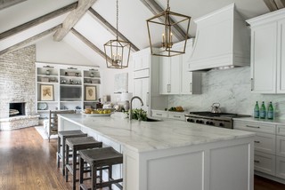
Foster laid out the all-electric kitchen, and the design team, Studio IQL, selected the finishes. The owners wanted the new materials to feel like they would age gracefully with the old ones, they told In With the Old, so they opted for soapstone countertops on half of the island and on the coffee bar, which backs up to the pony wall.
After some trial and error, the original pressed tin ceiling was painted bronze, but in this photo you can see a small section in the center that was left unpainted to show off its original patina.
This article was originally published by a www.houzz.com . Read the Original article here. .

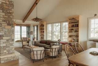
As for the house, the couple wanted a home where their children would grow up, but they were also thinking about how it would function for them once the kids flew the nest. As someone born and raised in the area, Tice wanted the design to nod to his favorite “old-school” Bethany Beach cottages while also having a more modern and minimalist design.
This article was originally published by a www.houzz.com . Read the Original article here. .

When a homeowner saves photos to Houzz ideabooks, it helps pros earn a Best of Houzz Design award, giving them recognition for their compelling designs. When homeowners leave reviews on a pro’s Houzz profile, it helps that pro earn a Best of Houzz Service award. There’s also a new category this year: the Innovator award. Pros earning a badge in this category have won a service award this year, use Houzz Pro software and are Houzz Pro certified. So if you see a Best of Houzz badge on a pro’s profile, you know their work is popular among homeowners, their customer service is well-liked, they are using the latest software tools to streamline the design and construction process for their clients, or all of the above.
Here, we highlight 15 enduring design ideas from photos that won a Best of Houzz Design award. In some cases, the pro also won a Best of Houzz Service award or a Best of Houzz Innovator award. Strive for some or even all of these home design ideas and you’re bound to end up with a home that will never go out of style.
This article was originally published by a www.houzz.com . Read the Original article here. .

“They came back really into Scandinavian modern style,” Pueringer says. “Because this is a horse farm, they were also into an equestrian Ralph Lauren look, meaning plaid patterns and colors like deep green, burgundy and brown. They also told me they loved the feel of Scottish country farmhouses. They wanted sophisticated style, but because this is a farm and they have a large dog, it needed to be practical and durable. At first I thought, ‘How in the world am I going to make all of that work?’”
This article was originally published by a www.houzz.com . Read the Original article here. .

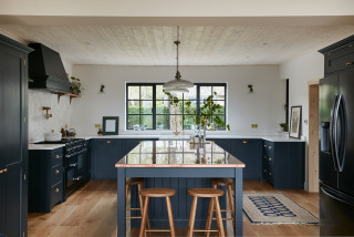
Kitchen at a Glance
Who lives here: A couple
Location: Leicestershire, England
Size: About 140 square feet (13 square meters); about 16 by 9 feet
Designer: Matt Fern of deVOL
Simple, honest materials, open cabinets and rich copper details combine to make this farmhouse kitchen feel warm and welcoming.
“It’s a classic Victorian staff kitchen in many ways — the open shelving, butler’s sink and scaffold-board [countertops] are all simple, functional features of an honest, hard-working space,” designer Matt Fern of deVOL says.
Materials were key in this project and copper and brass both feature heavily. “It was important that it wasn’t fussy or too polished,” he says. “It was important that it wasn’t fussy or too polished. They wanted a rustic farmhouse look with the emphasis on functionality,” Fern says.
Open cabinets were a careful design choice to create a warm, practical feel to the kitchen. “It’s an unashamed reflection of a working farmhouse kitchen, with all the pans on display where they’re close at hand,” Fern says.
“People are often reluctant to go for open cabinets, saying they’re just not tidy enough, but this couple embraced the idea, which was really refreshing,” Fern says. “They’re a good way to show your personality, whether you display decorative pieces or more functional items, such as colanders and crockery.”
9 Green Paint Colors to Consider for Your Kitchen