This article was originally published by a www.houzz.com . Read the Original article here. .
This article was originally published by a www.houzz.com . Read the Original article here. .

Wanting a more open and streamlined layout for entertaining guests, as well as a style that looked fresh and better suited to the Southwest, the homeowners hired designer Kimberley Worswick to spearhead a major overhaul. Worswick rethought the layout, moving the location of the kitchen to the dining room. She ditched the angled peninsula in favor of a large open-base island that can seat 10 people. Another, more standard island now sits in the main kitchen area and has additional seating, storage and the main sink, which creates an efficient work triangle. White-and-wood cabinets, zellige-look ceramic backsplash tile and Mediterranean-style pendant lights deliver an airy and welcoming style that nods to the home’s surroundings.
This article was originally published by a www.houzz.com . Read the Original article here. .

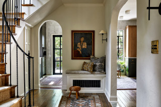
A Washington, D.C., family of four asked designer Sara Swabb of Storie Collective to update its 1936 Tudor-style home in a way that honored the home’s roots while bringing it into the modern era. In the entry, Swabb, who uses Houzz Pro business software, opened things up by widening doorways to keep sightlines clear to the kitchen and dining areas and allow natural light to be shared between the rooms.
In the kitchen, a warm green cabinet color, an arched range alcove and handmade terra-cotta tile flooring in a herringbone pattern create a fresh style that nods to the home’s past. A zellige tile accent wall spans the room, helping visually connect the main cooking area to a nearby zone containing a paneled fridge, a secondary sink and a built-in coffee machine. Textured wallpaper and patterned draperies energize the dining room, and midcentury modern furnishings perk up the living room.
Read more and save photos
This article was originally published by a www.houzz.com . Read the Original article here. .
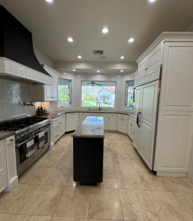
A backsplash featuring matte white scallop-shaped ceramic tiles brightens the room and adds visual movement. An upgraded 30-inch induction range sits below a hood with wood trim that coordinates with the other wood details in the room. A stainless steel 36-inch counter-depth 4-door smart refrigerator (partially visible) is to the left of the sink.
A pair of modern pendant lights over the island coordinate with other black and brass finishes used in the room. (The kitchen also has recessed LED ceiling lights, which were digitally removed by the photographer to highlight other design details.)
Backsplash: Prado in Andalucia, Mirazur collection, Sonoma Tilemakers; pendant lights: Blaine 16-inch, Rejuvenation; paint colors: Wind’s Breath (walls) and Super White (trim), Benjamin Moore
Shop for your kitchen
This article was originally published by a www.houzz.com . Read the Original article here. .
![]()
To freshen up the look and feel, the couple created an ideabook on Houzz, with inspiration photos they shared with Esslinger. He worked within the same basic footprint but ditched all the former materials and components. Lots of light and bright finishes brighten the space. Esslinger used the same marble tile in various areas, but to create visual interest and texture he played with pattern and shape — hexagons behind the tub, herringbone on the floor, large-format rectangles in the shower. Deep blue vanities and brass details elevate the style.
This article was originally published by a www.houzz.com . Read the Original article here. .

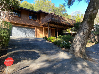
Look closely at the left side of this photo, where the original siding meets the new fiber cement siding, to see a thoughtful detail. The new siding juts out from the rest of the facade. “This added a thickness and clearly defined the entry and the area underneath the deck,” Shoup says.
This is an “upside-down” house, meaning the bedrooms are on the ground floor, and the living room opens onto the deck. The deck also can be viewed from the kitchen, as the floor plan is open. It’s easy for the homeowners to pour themselves a cup of coffee in the morning and then enjoy it outside among the tree canopies.
This article was originally published by a www.houzz.com . Read the Original article here. .

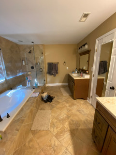
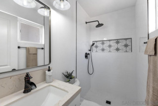
The remodeling team replaced the built-in tub with a freestanding model that helped loosen up the layout and allow for a bigger shower. White marble-look porcelain tiles cover the floor and the walls wrapping the shower and tub area, creating a brighter look. Pale gray walls also brighten the space, while midtone gray vanities and chrome fixtures and details add touches of fresh, modern style.
This article was originally published by a www.houzz.com . Read the Original article here. .

“I like to minimize overhead light in a bathroom,” Clark says. “You get better light from eye level when you’re putting on makeup. But the vanity was so long that it really needed something in the center, so I added the glass pendant light there.”
The mirrors hide medicine cabinets. “Some of my clients are reluctant about medicine cabinets at first because they tend to all look the same. But these arched mirrored medicine cabinets are really pretty,” Clark says. The frames are brass.