Tag

Feet

Browsing


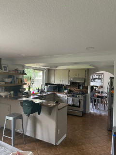
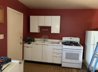
This couple’s 1970s kitchen wasn’t giving them the inviting spot for hosting family and friends they wanted. While they were happy with the layout of the 160-square-foot space, their litany of grievances included aging off-white plywood cabinets, brown laminate countertops and beige tile flooring. Old appliances and a two-level peninsula also made things unwelcoming.

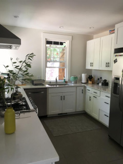
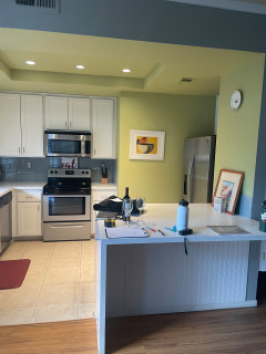
Looking for improved style and function, they turned to remodeler Art Kulch to help them create a more vibrant look with color and texture. New sage green cabinets and wood-look vinyl plank flooring elevate the space with nature-inspired style. Marble-look quartz countertops and glazed white backsplash tile lighten things up. New appliances and a streamlined peninsula make the updated kitchen a joy to use and entertain in.


This article was originally published by a www.houzz.com . Read the Original article here. .


b Architecture StudioSave Photo
This is the view looking toward the back of the house. The structure is shaped like a T, with two bedrooms on either side of the central corridor. Despite the small square footage, Brown was able to carve out two bedrooms and two bathrooms, plus a small loft reached by ladder that can function as a sleeping or hangout space. In the main living area, which has open but well-defined living, dining, cooking and entry zones, a 12-foot ceiling helps to add a sense of lightness and spaciousness.

For the interior design, Brown brought in Michael Ferzoco of Eleven Interiors, with whom he’d worked before. Both describe the process of creating the home as a true collaboration. “This team of interior designers, landscape architects [and] builders was really a joy to work with, and it all stemmed from these clients because they wanted to understand and hear everyone’s ideas,” Brown says.

Early on, the homeowners had shared with Eleven Interiors their inspiration photos — including some they’d found on Houzz — of spaces that had fairly traditional seaside motifs and colors. But the designers encouraged their clients to think less literally. “In one of the images that they sent to us, there was a beautiful sunset of the actual bay that the house sits on … and we took that as the central cue in developing the color scheme and the concept for the interior,” Ferzoco says. The beach and seagrass outside the windows provided yet more inspiration. The floors and ceiling trusses, for example, are sand-colored whitewashed bleached white oak. The result is a coastal look that’s not too on-the-nose.


This article was originally published by a
www.houzz.com . Read the Original article here. .


Kirk Riley DesignSave Photo
The shower accent wall consists of Carraro Blanco and Thassos marble mosaic tiles with touches of blue. “They were the inspiration for the bathroom,” Kirk says. “We played off that hexagon shape for other parts of the room. A subtle repeat of shapes and colors throughout the room makes the bathroom feel comforting.”

A 24-inch stainless steel grab bar on the back wall offers support for those entering and exiting the tub. The shower-tub combo also includes a pressure-balanced valve system, hand shower, integrated diverter tub spout and a white acrylic tub. A custom operable window brings in fresh air. Surrounding the window is 2-by-12-inch ogee molding in Apollonia marble in a honed finish. “We knew we wanted to add this hall bathroom, but then realized it would be lovely to add that window,” Kirk says. “It really brightens the space.”

The bathroom walls are covered in a blue nonwoven wallpaper with a cloth-like pattern that pairs wavy horizontal lines with straight vertical ones. “It gives you the look and appearance of linen, but it’s more durable and appropriate for a bathroom,” Kirk says.

An ADA-compliant chair-height toilet has an elongated bowl for extra comfort. “I love that this toilet is one piece and skirted for easy cleaning,” Kirk says. A teak bench offers a spot for resting towels or a book while soaking in the tub.

Accent wall tile: Aliso hexagon in blue on Carrara Blanco, StoneImpressions; grab bar: 24-inch in Brilliance Stainless, Delta; teak bench: Sage Interiors; toilet: St. George, DXV; tub: Archer, Kohler; wallpaper: Linen Strie in blue, York Wallcoverings

8 Golden Rules of Bathroom Design


This article was originally published by a
www.houzz.com . Read the Original article here. .


Jordan Design + Build GroupSave Photo
After: Vilov stripped the kitchen, changed its G shape to an L by eliminating the peninsula and added space by expanding into a sunroom. A narrow island adds workspace and provides good flow, while the relocated sink and new stainless steel appliances, including a wall oven with a combo microwave and convection oven above, boost functionality and add gleam.

The space lost a window but gained a walk-in pantry (through the door at back left), fulfilling a dream of one of the homeowners. A new full-height glass door, along with pendants and relocated recessed lights, more than make up for the lost rays.

Knotty alder open shelves above the sink break up the cabinet run and, along with red oak hardwood flooring and a wood island base, warm up the abundance of light-maximizing white.

Wall paint: Drift of Mist, Sherwin-Williams; cabinets: Woodharbor Custom Cabinetry; cabinet hardware: Lombard knobs and pulls in matte black, Franklin Brass; countertops: Frosty Carrina, Caesarstone

Read more about this project

More on Houzz
Read more kitchen stories
Browse kitchen photos
Hire a kitchen remodeler
Shop for kitchen products


This article was originally published by a
www.houzz.com . Read the Original article here. .


CraftedWild CabinetrySave Photo
After: De Vito knocked the kitchen back to the studs and raised the ceiling to over 12 feet. He added a fixed skylight above and a custom 4-by-8-foot fixed window on the left wall. He also swapped the solid door for a glass-paneled one topped by a transom window.

They added a sleek island with a sink to the single-wall layout to reconfigure the room into what’s effectively a galley kitchen, which has two parallel walls of cabinetry. Now De Vito and Carrasco can stand at the sink and socialize with people in the adjacent living room.

The couple wanted to keep the kitchen neutral and minimal, so they chose handleless, slab-front matte white laminate cabinets and painted the walls and ceiling white. The main kitchen flooring is 48-by-48-inch porcelain tile, also white.

To warm up the mostly white palette, they used laminate that resembles white oak on the cabinets above the cooktop and on the side of the island. Engineered white oak flooring extends from the island into the living room.

Cabinets: Eurodekor laminate in Vicenza Oak and Elegante Matte White, Egger; wall and ceiling paint: All White, Farrow & Ball


This article was originally published by a
www.houzz.com . Read the Original article here. .


“After” photos by Stephanie Russo

3. Log Cabin Loveliness

Kitchen at a Glance
Who lives here: A couple and the youngest two of their four children
Location: Nevada City, California
Size: About 75 square feet (7 square meters); 9 feet, 10 inches by 7 feet, 11 inches
Designer: Jada Gilbert of Design Shop Interiors

Before: This log cabin in the foothills of the Sierra Nevada mountains had beautiful views and nature at its doorstep. It didn’t, however, have a kitchen befitting the new homeowners — a family with two kids. Basic appliances, not much storage or counter space, a galley layout and an uninspired, dark look spoke to the home’s former use as a rental. The owners hired designer Jada Gilbert to give them an inviting kitchen in a lighter palette as part of a bigger home makeover.


This article was originally published by a www.houzz.com . Read the Original article here. .

Pin It