This article was originally published by a www.houzz.com . Read the Original article here. .

This article was originally published by a www.houzz.com . Read the Original article here. .
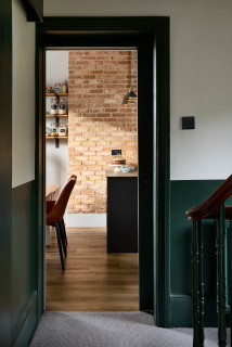
When the homeowners of this split-level Victorian home first contacted interior designer Amy Hunt, they were struggling to know how to make their new place feel like home. They needed improved storage and comfortable furnishings and decor that would create a welcoming and relaxing atmosphere. “There were no wardrobes, no cupboards and just lots of hooks, so it really did need rethinking,” Hunt says. Aside from addressing the couple’s practical needs, Hunt, who uses Houzz Pro business software, introduced dark color and texture, both to warm up the home and to make the narrow spaces look bigger.
Read more and save photos
This article was originally published by a www.houzz.com . Read the Original article here. .
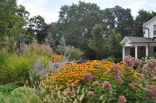
Purple coneflower and Russian sage make an all-star combination for late-summer and fall perennial beds. Purple coneflower (Echinacea purpurea, zones 3 to 8), native to Eastern North America, are cold-hardy perennials that bloom for months, attracting native bees and butterflies. After the bloom, the flowers’ spiky deep-orange centers can be left in the garden as decorative seedpods (and a feast for birds).
With its pale stems and delicate lavender-blue flowers, Russian sage (Perovskia atriplicifolia, zones 5 to 9) adds an airy quality to beds, appearing like a pale-colored cloud when planted in drifts. Russian sage blooms from July to October.
Both plants are drought-tolerant, making them a good pair for a tough, low-water spot like this sidewalk garden by Garden Stories in Portland, Oregon.
Water requirement: Moderate to low, once established
Light requirement: Full sun
20 Favorite Flowers for the Fall Landscape
This article was originally published by a www.houzz.com . Read the Original article here. .
Maison & Object, the twice-annual international meeting of decoration, design and lifestyle professionals, returned to the Paris Norde Villepinte Exhibition Center on Sept. 5-9, 2024. The design fair showcased the main colors that will illuminate tomorrow’s furniture, coverings and accessories collections. The palette of new products at the September show was earthy and natural, bringing back into fashion the flagship shades of 1970s design in a retro-futuristic atmosphere.
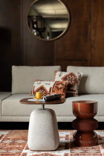
Brown, which has been off the radar for several years, is making a comeback this fall, bringing with it all the nostalgia of the ‘70s. Warm, it is found mainly in tones of fawn and caramel. The fall collection by Dutch brand Dutchbone is proof of this, as the hue is used on numerous accessories and pieces of furniture such as the Appolo stool in Terra, pictured.
9 Ways Designers Are Using Warm Neutral Colors Right Now
Another key ‘70s hue, heather gray, was also very much in evidence on the show floor this year, as a favorite for seating textiles and sofas. It helps to create a retro aesthetic, as in this suite from Dutchbone. Heather fabrics are generally in vogue and can be found enhancing other shades, such as brown.
Get product discounts through the free Houzz Trade Program
The new season envelops interiors in warm colors, with ocher hues taking center stage. They can be found as much on bed linens and accessories as on wall coverings. The new Aubusson collection from French wallpaper maker Papermint is proof of this, with the Douce Montage pattern featuring these soft, warm tones on a mountainous landscape.
5 Big-Picture Design Trends Popular Right Now
Continuing the trend of warm tones, beige and its sister shades are widely present this year in the collections of various suppliers, creating a new mineral palette far from the cold rocky tones we’re used to seeing. Zuiver’s Saigon tapi is a perfect example, softening the nuances between grays and beiges.
Designers Share Their Favorite Warm Neutral Paints
One of the trends to emerge from this Maison & Objet is neutrality, with the idea of leaving more room for the environment surrounding the interior. Purity is the order of the day, with cream and beige tones, sometimes tending toward bronze. We find them here on the walls with another Papermint product: the L’envol du Héron print from the new Aubusson collection.
You can help clients visualize their planned home with Houzz Pro Mood Boards and 3D Floor Plans. You can also share photos, files, estimates, proposals and more with clients using Houzz Pro.
Learn about Houzz Pro software
Alongside these natural shades are brighter, more vivid colors. While terra cotta has been a favorite in interior design palettes in recent years, it is now giving way to orange. Increasingly present, it is generally seen in the form of small touches as an interior illuminator. These vases by Oustao Cicada are one example.
20 Furniture Trends at the Spring 2024 High Point Market
Shimmering tones are the next big color trend this year. Inspired by new technologies, it has a futuristic aesthetic with its multicolored reflections reminiscent of rainbow hues, and its shimmering effects. Imperfettolad’s Beetle line is a perfect example of this with its iridescent fiberglass seats inspired by the shine of a beetle.
Need a pro for your home remodeling project?
Let Houzz find the best pros for you
Halfway between burgundy and raspberry, wine sediment is also making a comeback this year, with hints of eggplant and even purple for the more daring. This is one of the shades chosen by Gimmic Design to adorn one of its office chairs. In addition to being stylish, they are also part of a circular economy approach to waste reduction.
5 Ways Designers Are Working With Rich Warm Tones Right Now
9. Cosmic Blue
Blue also features prominently in exhibitors’ new collections. In its darkest forms, sometimes bordering on ultramarine, it recalls the theme of the sky, the cosmos. It was at the heart of the What’s New in Decor scenography, imagined as every year by renowned trendsetter Elizabeth Leriche.
10 Paint Colors Ready to Take Over in 2024
This article was originally published by a www.houzz.com . Read the Original article here. .
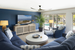
Once you’ve selected and purchased a paint color, it’s time to commit. Paint will look quite different during the painting process, and it is very important not to judge the color until it has been properly applied in the necessary number of coats — at least two, but often three or more, depending on the product and shade.
It’s truly wisest not to judge the color at all until at least the next day, and to give yourself some time to adjust to the change in your space before jumping to any conclusions.
This is especially true with darker shades, which will visually shrink the space in a way you will need a little time to get used to.
This article was originally published by a www.houzz.com . Read the Original article here. .
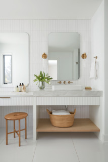
The color of your grout can make or break the look of your tile. The grout color can create different effects or visually blend away. To help you choose the right grout color for your tile scheme, here are some favorite looks you might want to consider, along with some general advice for virtually every tiling scenario you might encounter.
This article was originally published by a www.houzz.com . Read the Original article here. .
House at a Glance
Who lives here: A family of five with two dogs
Location: Houston
Size: Six bedrooms, eight bathrooms
Designers: Lynn Holender Designs (interior design) and Sullivan, Henry, Oggero and Associates (architecture)
Builder: Unika Homes
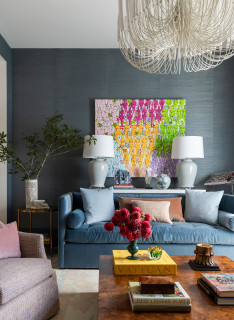
To understand the homeowners’ style and Holender’s approach, it’s best to start in the parlor. “They both love the work of artist Donald Robertson. This painting that they already owned needed a place of importance,” she says. The wife’s favorite color is blue and the husband’s is green. Holender gave each of them spaces that highlighted these hues.
“My client didn’t like the idea of a formal living room. She preferred the idea of a parlor,” Holender says. She liked that the word had its origins in the French word parler, which means “to speak.”
“This room encourages people to converse, make music and make connections without screens,” the designer says.
Find an interior designer on Houzz