This article was originally published by a www.houzz.com . Read the Original article here. .

This article was originally published by a www.houzz.com . Read the Original article here. .
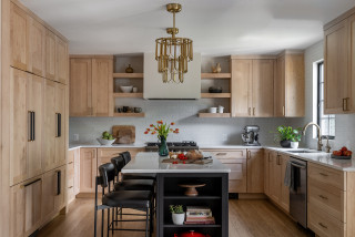
Designer: Carlos Nyce of TriVistaUSA Design + Build
Location: Arlington, Virginia
Size: 168 square feet (16 square meters); 11 feet, 8 inches by 14 feet, 5 inches
Homeowners’ request. “The client came to us seeking to improve their home layout, with one of the main goals being to enhance the flow for better entertainment space,” designer Carlos Nyce says. “They desired an open, functional kitchen layout, but the existing space didn’t allow for that. As part of our architectural design proposal, we suggested relocating the kitchen to the opposite side of the house, where more space was available. This change allowed us to reconfigure the kitchen, adding a highly functional island and additional storage. The client’s aesthetic preferences leaned toward clean lines, bright, warm wood tones, with touches of industrial style and a bit of glam.”
Wood cabinets. Natural maple wood cabinets in a matte finish. “They wanted their kitchen to feel bright, warm and cozy, while also introducing some industrial elements for contrast,” Nyce says. “We worked with the concept of using a lighter tone around the perimeter, paired with darker accents on the island, hardware and other details. The house facade featured black-painted brick, and [the homeowners] were keen on incorporating this dark color into the interior details. By integrating natural maple matte wood cabinets along the perimeter with a white brick-look tile backsplash, we achieved the perfect balance of cozy and industrial. The island, painted in Sherwin-Williams Tricorn Black, stands out against the lighter backdrop and provides just the right amount of darkness they were looking for.”
Other special features. Marble-look quartz countertops.
Designer tip. “Balance is key,” Nyce says. “To achieve the perfect look, you first need a clear reference for where you want your design to go. If you’re blending multiple styles, the key is always balance — incorporating textures, colors, materials and elements in the right proportions so the space feels harmonious.”
Find kitchen remodelers near you
This article was originally published by a www.houzz.com . Read the Original article here. .
With advances in technology and efficiency, new appliances are an important upgrade for many renovating homeowners.
Among large kitchen appliances, renovating homeowners go for dishwashers (71%) and microwaves (70%) most frequently, followed by ranges (64%), refrigerator-freezer combinations (62%) and range hoods (61%). Homeowners also frequently upgrade cooktops (39%) and wall ovens (31%), while smaller shares opt for beverage refrigerators (18%) and wine refrigerators (14%).
For the most part, homeowners prioritize quality and aesthetics over cost. Quality is the top priority, influencing 64% of homeowners, while look and feel is most important for 50%. Though cost is a lower priority for most, 29% of renovating homeowners still cite it as the reason for their appliance purchase. Substantial shares also prioritize size (27%), specialty features (25%) and energy efficiency (22%).
Meanwhile, stainless steel is by far the leading choice for appliances, chosen by 74% of homeowners. White (7%), black stainless steel (5%) and black (3%) trail far behind.
This article was originally published by a www.houzz.com . Read the Original article here. .
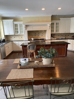
Four cabinet hardware styles jazz up the look further: acrylic-and-brass pulls on the drawers, brass knobs on the perimeter doors, custom horn pulls on some of the island drawers and matte black knobs on the glass-front doors.
Other minimally invasive moves that made a major impact: extending the backsplash tile to the ceiling, adding a marble shelf (made from a remnant), placing sconces on the stove wall and swapping a dark runner for a light-colored patterned one.
Read more about this project
This article was originally published by a www.houzz.com . Read the Original article here. .
Once you’ve grouped your items, plan to place them in cabinets or drawers close to where their function is performed.
In the pantry, place the foods that you use most often in the easiest-to-reach places. (One possible exception: “If you think you eat too many snacks, put those up high so you don’t see them as often, and it’s more of a to-do to get them,” says Tori Cohen, an organizing and decluttering specialist in New York City.)
While you’re working out what to store in each cabinet or drawer, Duncan suggests placing temporary labels made of blue painters tape on the cabinet or drawer where each group is going. This will help you get a sense of how your storage plan is shaping up and simplify making adjustments as you go.
This article was originally published by a www.houzz.com . Read the Original article here. .
Designer: Caylen Harrison of Janet Brooks Design
Location: Scottsdale, Arizona
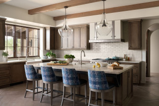
Homeowners’ request. “When we designed the home, the client was in love with the idea of using authentic adobe as the primary building material, from a practical energy-efficiency approach as well as for the design aesthetic,” designer Caylen Harrison says. “This decision drove the rest of the design process. We designed a kitchen that felt warm, soft and textural to play off of the natural character of the adobe walls, from the cabinet finishes to the backsplash tile and hood design.”
Wood cabinets. “The kitchen is stained alder cabinets with a glaze,” Harrison says. “The client loved the soft, natural finish of the brown stain — we wanted to keep it a midrange color, not too dark and not too light due to the lower ceiling and the color of the stained concrete floors also being a little darker. We also didn’t want to introduce too many finishes in this space. It was important to us and the client that the kitchen wasn’t visually overwhelming and that it felt functional and understated. To complement the brown cabinets, we went with a lighter natural quartzite countertop material and a textural backsplash tile, also in a lighter colorway.”
Other special features. “To add some additional visual interest, we made a point to focus on subtle detailing, such as the metal banding and angled supports on the island overhang and the zinc straps on the drywalled kitchen hood,” Harrison says. “Both of these accent pieces were custom-fabricated locally.”
Designer tip. “To visually help the flow of the continuous spaces, we decided to proceed with a 48-by-48-inch diamond scoring pattern in the concrete floors,” Harrison says. “This helps make the spaces feel bigger, and the diagonal lines guide you from space to space — instead of a square scoring layout, which would have made the spaces feel more static and confined.”
Backsplash tile: Grove Brickworks in Muslin, Waterworks; island pendant lights: Everly bell with seeded glass, Kichler; wall paint: Crystal Haze, Dunn-Edwards
Find kitchen remodelers near you
This article was originally published by a www.houzz.com . Read the Original article here. .
Designer: Kelsey McGregor of Kelsey Leigh Design
Location: Sarasota, Florida
Homeowners’ request. “This house is situated right on the water, so we wanted to make sure it felt in line with looking like a beach home without feeling overly theme-y,” designer Kelsey McGregor says.
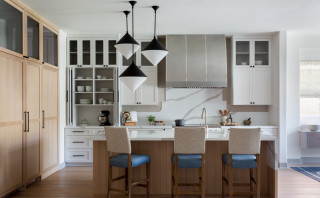
Wood cabinets. “We decided to go all rift-sawn white oak cabinetry here,” McGregor says. “Knowing that there was going to be limited upper cabinetry, especially on the focal range wall, we knew it wouldn’t feel too heavy. So we decided to go all wood with the cabinetry, knowing that the white walls would break it up and then it would create interest and warmth in the space.”
Other special features. “We didn’t want to use predictable blues and sea colors as the project’s color palette, but instead chose warm wood tones and the marble backsplash to introduce those ocean colors,” McGregor says. “I love the pairing of warm and cool tones in a space. The warm wood helps warm the cool of the marble and gray countertops and gray bar stools and gives the room a beautiful balance. The island countertop is made to look like cement, which pairs well with the textural bar stools, and the statement marble that was used on the perimeter countertop and backsplash has so much movement in its veining.”
Designer tip. “Get creative with storage,” McGregor says. “We want to make the kitchen cabinetry a little less predictable than just uppers and lowers. I like to eliminate upper cabinetry, and instead opted for counter-to-ceiling-height cabinets here on the range wall, giving it a breathier statement. Other creative storage ideas are adding open storage to the island or adding a marble shelf like the one here flanking the hood.”
Wall paint: Greek Villa, Sherwin-Williams
More on Houzz
Read more kitchen design stories
Browse kitchen photos
Hire a kitchen remodeler
Shop for your kitchen
This article was originally published by a www.houzz.com . Read the Original article here. .

Designer: Kelsey McGregor of Kelsey Leigh Design
Location: Sarasota, Florida
Homeowners’ request. “This house is situated right on the water, so we wanted to make sure it felt in line with looking like a beach home without feeling overly theme-y,” designer Kelsey McGregor says.
Wood cabinets. “We decided to go all rift-sawn white oak cabinetry here,” McGregor says. “Knowing that there was going to be limited upper cabinetry, especially on the focal range wall, we knew it wouldn’t feel too heavy. So we decided to go all wood with the cabinetry, knowing that the white walls would break it up and then it would create interest and warmth in the space.”
Other special features. “We didn’t want to use predictable blues and sea colors as the project’s color palette, but instead chose warm wood tones and the marble backsplash to introduce those ocean colors,” McGregor says. “I love the pairing of warm and cool tones in a space. The warm wood helps warm the cool of the marble and gray countertops and gray bar stools and gives the room a beautiful balance. The island countertop is made to look like cement, which pairs well with the textural bar stools, and the statement marble that was used on the perimeter countertop and backsplash has so much movement in its veining.”
Designer tip. “Get creative with storage,” McGregor says. “We want to make the kitchen cabinetry a little less predictable than just uppers and lowers. I like to eliminate upper cabinetry, and instead opted for counter-to-ceiling-height cabinets here on the range wall, giving it a breathier statement. Other creative storage ideas are adding open storage to the island or adding a marble shelf like the one here flanking the hood.”
Wall paint: Greek Villa, Sherwin-Williams
More on Houzz
Read more kitchen design stories
Browse kitchen photos
Hire a kitchen remodeler
Shop for your kitchen
This article was originally published by a www.houzz.com . Read the Original article here. .
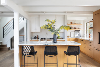
For this young Minneapolis couple that includes a chef, designer Alisa Dragt-Hoffman of McDonald Remodeling created an open kitchen with custom rift-cut white oak cabinets that lend warm Japandi style. Clever sliding doors with round drilled finger pulls on the upper units allow the chef to quickly grab items while cooking. The backs of the uppers feature a slatted detail that echoes that of the island end. A tall wine rack integrated into the cabinetry on the left offers storage for up to 11 bottles. White oak flooring continues the warm look.
Read more about this kitchen
This article was originally published by a www.houzz.com . Read the Original article here. .
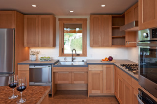
Frameless cherry cabinets in a low-sheen stain and other wood details add a generous dose of warmth. The lower cabinets and new island are painted a warm yellow (Brittlebush by Sherwin-Williams). Langreck incorporated the existing refrigerator but built out tons of storage surrounding it and the nearby window. “By adding a pantry cabinet over by the window we were able to gain storage over there,” she says. “We now have the microwave inside that cabinet as well, since they don’t use it very frequently.”
The island includes additional storage and seating on three sides. “Wrapping the seating around made it more comfortable for conversation and freed up the end of the island toward the sink to act as prep space without a chair in the way,” Langreck says.
She designed the wood structure over the island that was built by the husband and stained to match the cherry cabinets. It features integrated LED lights. “The ceiling heights are different with that header running across, so it was a way to connect the two spaces together and illuminate the seating area,” Langreck says. A handmade yellow pendant light complements the cabinets. The ceiling also has new LED recessed lights.
Natural maple flooring was sanded and finished in place. “They originally tried to salvage the wood floor underneath the ceramic tile, but it had too many holes and needed to be replaced,” Langreck says. “We evened out the floor in the kitchen and mudroom so it’s all one level.”
Cabinetry: Hudson panel door style, cherry in Mission low-sheen stain, Dura Supreme Cabinetry; wall paint: Creamy, Sherwin-Williams
Find kitchen remodelers near you
This article was originally published by a www.houzz.com . Read the Original article here. .
Meanwhile, LaFreniere tackled the countertop clutter from the inside out.
“When I do kitchens, I focus on what’s inside of the cabinet,” she says. “I go through the homeowners’ small appliances, every pot, every utensil, spices [and] Tupperware and really make sure that there’s a place for everything.”
On one side of the range is a utensil pullout with a knife block and towel storage, and on the other side is a spice pullout. LaFreniere eliminated the lazy Susan. “I don’t do corner cabinets,” she says. “I find them to be completely useless, no matter whether a lazy Susan or the kidney pullouts. I just leave them empty.”