This home in Northampton, England, had a kitchen with an adjoining dining area and a living room in a conservatory, but it felt gloomy and cramped. The owner, who lives here with her two sons, found interior designer Eleni Fantis on Houzz and asked her to rethink the design. “[The owner] wanted a real family space, with defined areas, but where they could all gather, cook, entertain and enjoy being together,” Fantis says.
Before Photo
The kitchen is the heart of the space and it was important that this was somewhere the owner could feel relaxed and enjoy making food, entertaining and teaching her boys to cook.
Find an interior designer on Houzz
Luckily, there’s a utility room through the door opposite the sink, so he didn’t need to find space for laundry appliances.
He made more use of the short wall with a full-height pantry cabinet — one of the owner’s key requests — a refrigerator and cabinets above and below the combination and standard ovens.
Kerr stopped short of the ceiling for a maximum sense of space. “Having units to the ceiling makes a room look smaller — when you can’t see the wall above, it closes everything in — so we left a gap,” he says.
Shop for your kitchen
The white doors are vinyl-wrapped, making them robust, and the white countertop is durable quartz. Kerr went with a curved ceramic sink to add interest.
Fantis chose pretty pink and blue tiles for the backsplash. “[The owner] didn’t really have any pattern in her home, so I wanted to incorporate some delicate patterns so as not to overwhelm her,” she says.
Kitchen cabinet paint: Satin White and Richmond Denim, Jikoni Interiors
Find a kitchen designer
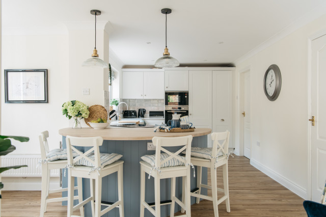
“Usually, the [cooktop] would go on the back wall, but because there was no space, that was the only way we could do it. You could have had a [standard] peninsula, but we tried to make it a bit more special. It makes the kitchen feel cozy and works really well in the space.”
New to home remodeling? Learn the basics
The wood-look luxury vinyl tile flooring pairs well with the oak shelves, and looks and feels warmer than the original tiles.
“[The owner] wanted us to fit in as many seats as we could,” Kerr says. “We created the circular shape so you can have people sitting round being sociable without all sitting in a line.” This section of countertop is oak, giving it the feel of a table.
The induction cooktop has a downdraft ventilation system that vents out through the wall. “An extractor hanging from the ceiling would have blocked the room,” Kerr says.
See why you should hire a professional who uses Houzz Pro software
Kerr has tucked a wine fridge and another cabinet into the peninsula unit. Neither is obvious from the living area, but they help maximize the storage.
An upholstered bench offers an additional seating spot when guests are over.
Before Photo
Before: Originally, the dining area was in the small room to the left and the living area was in a conservatory to the right.
After: Fantis had most of the wall between the two spaces removed. She sited the seating area near the French windows and moved the dining area into the conservatory.
Light can now circulate between the spaces, making them feel brighter and bigger.
The large armchair between the living room and kitchen is key to the color scheme. “The floral fabric was actually the beginning of the whole design, and is a printed velvet,” Fantis says. “[The owner] loved it so much, I persuaded the supplier to sell me additional [fabric], which we then used for some of the blinds.”
The original dark red curtains have been swapped for these pale blue ones, which fit with the fresh, light color scheme and are less dominating.
Before Photo
The conservatory roof had been badly lined in the past, so Fantis had that replaced.
This article was originally published by a www.houzz.com . Read the Original article here. .


Kitchen at a Glance
Who lives here: A woman with two sons
Location: Northampton, England
Size: About 120 square feet (11 square meters); 12 by 10 feet
Designers: Eleni Fantis of Omorfia Interior Design (interior design) and Ezra Kerr of Jikoni Interiors (kitchen design)
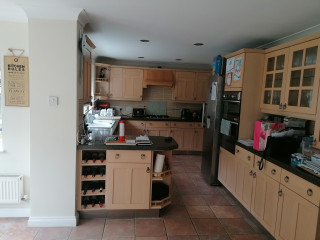
Before: The original kitchen was put in when the house was built. While there was plenty of storage, the arrangement made the area feel cramped.
Fantis wanted to use a kitchen company that would make the most of the space. Enter kitchen designer Ezra Kerr.