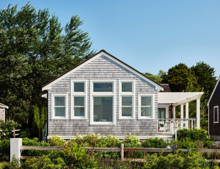
This is the view looking toward the back of the house. The structure is shaped like a T, with two bedrooms on either side of the central corridor. Despite the small square footage, Brown was able to carve out two bedrooms and two bathrooms, plus a small loft reached by ladder that can function as a sleeping or hangout space. In the main living area, which has open but well-defined living, dining, cooking and entry zones, a 12-foot ceiling helps to add a sense of lightness and spaciousness.
For the interior design, Brown brought in Michael Ferzoco of Eleven Interiors, with whom he’d worked before. Both describe the process of creating the home as a true collaboration. “This team of interior designers, landscape architects [and] builders was really a joy to work with, and it all stemmed from these clients because they wanted to understand and hear everyone’s ideas,” Brown says.
Early on, the homeowners had shared with Eleven Interiors their inspiration photos — including some they’d found on Houzz — of spaces that had fairly traditional seaside motifs and colors. But the designers encouraged their clients to think less literally. “In one of the images that they sent to us, there was a beautiful sunset of the actual bay that the house sits on … and we took that as the central cue in developing the color scheme and the concept for the interior,” Ferzoco says. The beach and seagrass outside the windows provided yet more inspiration. The floors and ceiling trusses, for example, are sand-colored whitewashed bleached white oak. The result is a coastal look that’s not too on-the-nose.